July 21, 2023
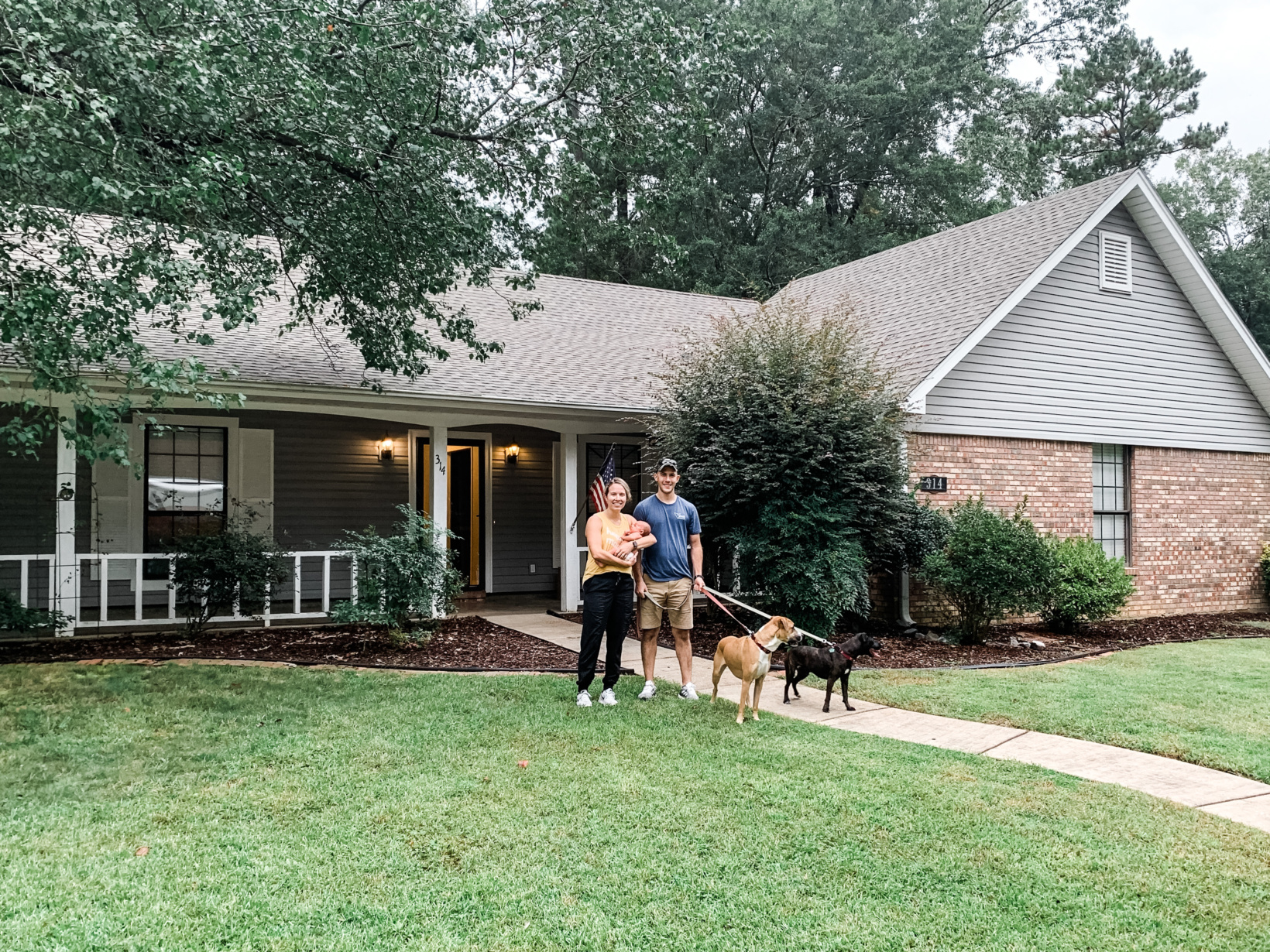
On September 25 we’ll celebrate three years of living in our Mississippi house. Pretty much since the month we moved in, we have been working on fixing up the interior. We only have one room left to work on and a few tiny details to finish up before sharing both the kitchen and guest/kids bathroom with you! With all of the work we’ve done on the interior, we figure it’s time to work on the exterior a bit. This past month we’ve been working a lot on the landscaping in the front and we started last weekend on the back. It’s already enhanced the way the house looks so much. The next thing in the works that we’re super excited about… PAINT! Here’s a reminder of what the house looked like the day we moved in with baby Ellie:
And today:
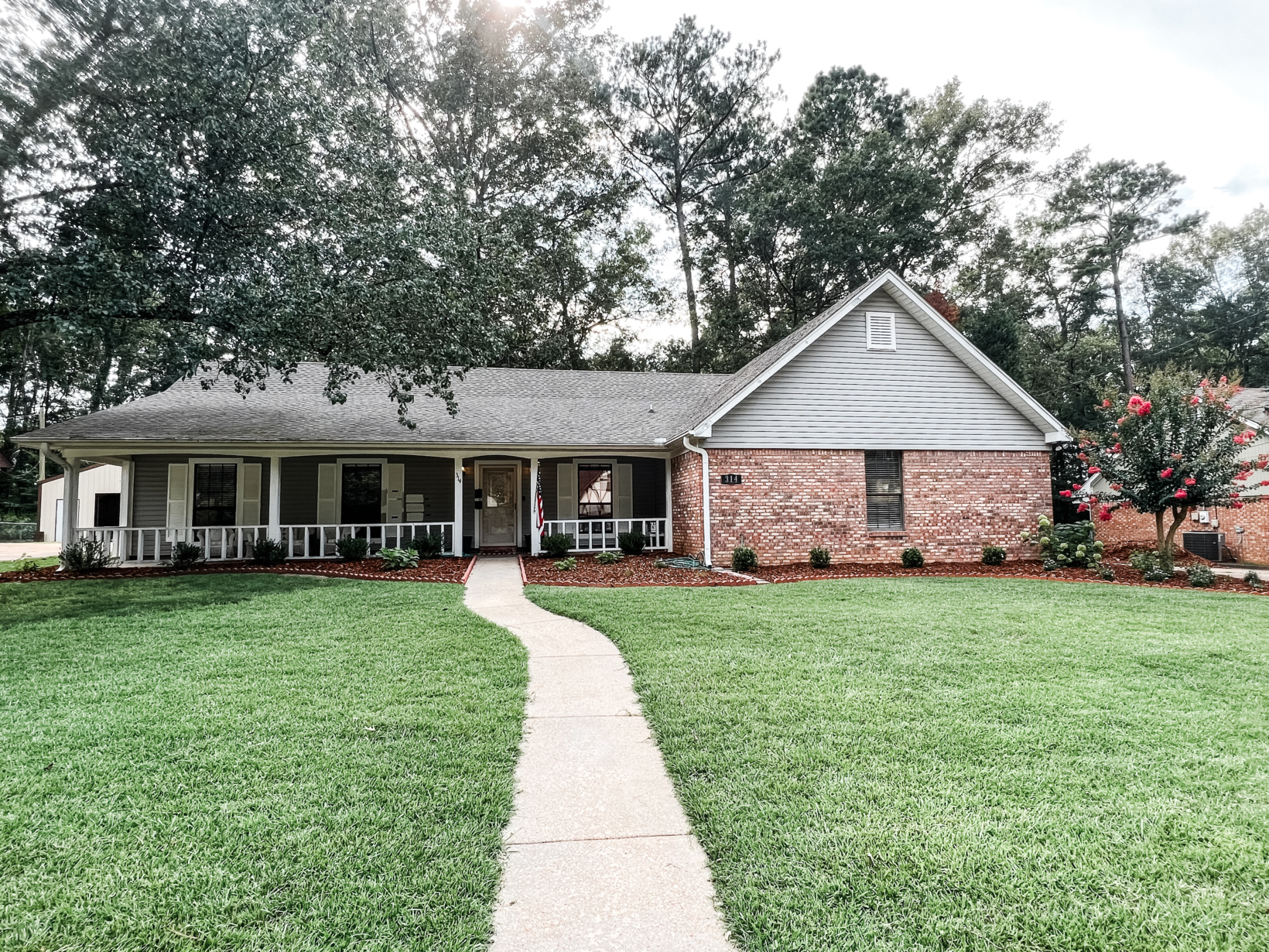
Don’t get me wrong, we don’t deeply dislike the exterior of this house as it is. However, painting it is something we’ve been saying ‘we’ll probably do that someday’ since we moved in just because it never felt like the outside was a good reflection of our style and work on the inside and it lacked cohesiveness. Considering nearly all of the exterior trim paint has chipped off at this point, that “probably someday” has arrived. Along with that, we could potentially be moving soon and intend to rent this house out so we want to not only have it all fixed up well before it’s occupied by renters but we also want to be able to enjoy it for a bit while we’re still here.
For the past few years (yes, I said years) I’ve been brainstorming what we were going to do paint wise but it has changed a bit since the original plan. Again, we’re aiming to create cohesiveness from the exterior to the interior while also remaining timeless. Originally we were leaning towards doing a classic creamy white and black accents. However, I don’t think it entirely fits the look of our house (I personally don’t think it’s classic enough for that palette so then it tends to look a bit trendy). After years of building a Pinterest board and throwing options in and out of a design board, these are the photos that inspired us the most (click on each photo to locate the source!).
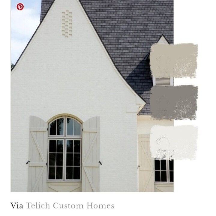
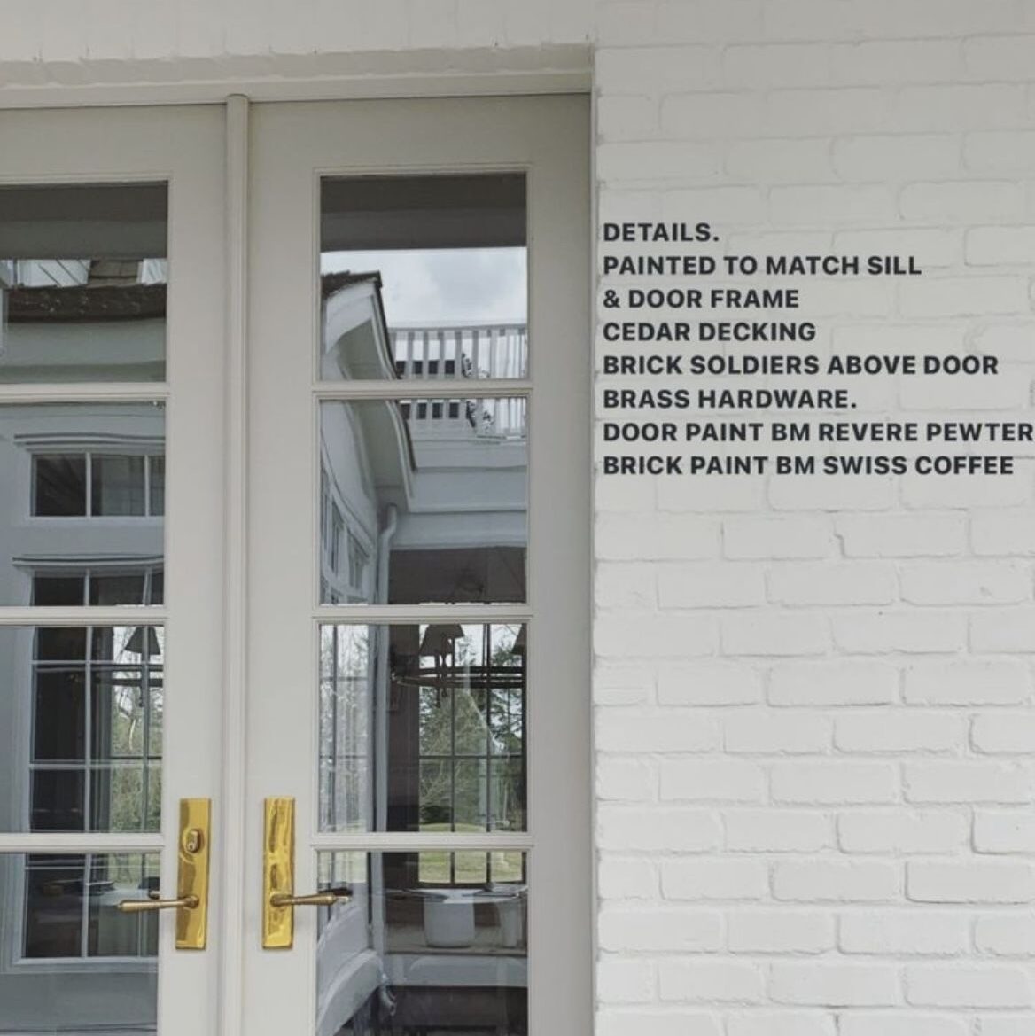

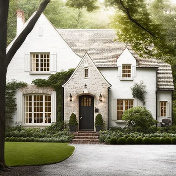
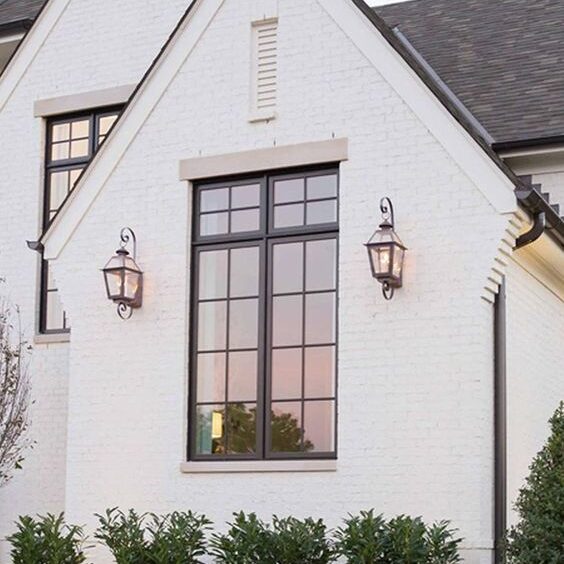
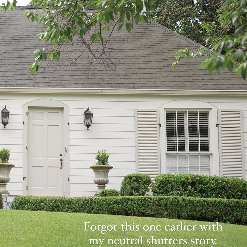
We received as estimate for painting the brick and not painting the brick. Ideally I’d want to paint it but we quickly decided that we’ll save that money to put towards a down payment on the potential next house. Besides, I think that by choosing a color palette that ties in the variation of color in the brick, it could end up being really pretty. I put our brick color (I just took a photo of it outside and pasted it into the Canva board), roof color, and black windows in the design board and moved color options in and out until we narrowed it down to buy a few paint samples.
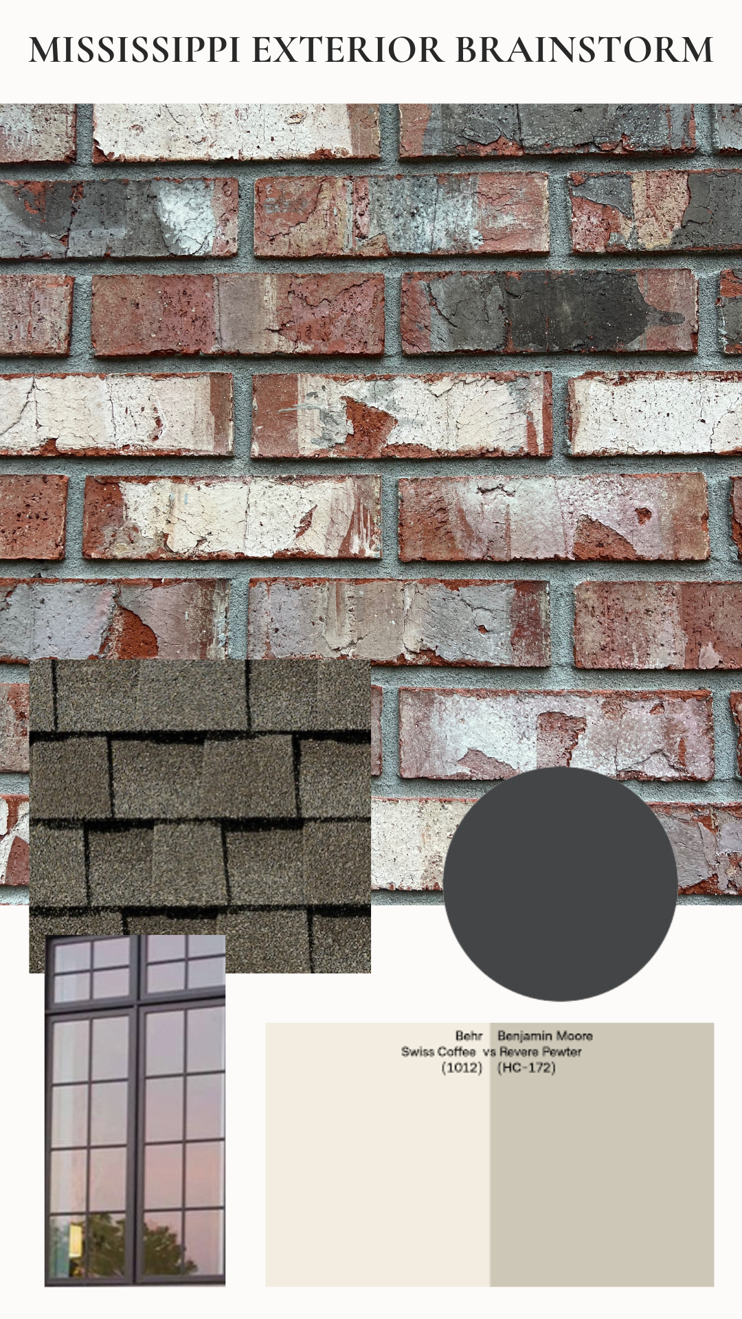
See how the creaminess of the white and the off black ties in with the variation of the brick? One of the flaws of the current paint colors is that the white is too stark compared to the brick. There needs to be a little bit of warmth in there to tie it all together. I love the house above in my inspiration photos with the black door so we’re leaning towards doing ours off black. Not only does it again pull in the brick but the windows as well. I’ll show you an example below of why a stark black doesn’t fit as well. The tan shutters will just be the pretty bow on top (you’ll find tons of those color notes in the brick as well)!
Once we narrowed down colors, I researched which colors to get samples of. Whites can be tricky as there are nearly an infinite number of options out there. We chose to try out Swiss Coffee which is a very popular option (and my dad’s favorite as a contractor), Pearly White which is the color of our friends house that is so stunning I eventually just asked her what color it was, and White Dove which is the color of the Garvin’s house (Jessica has a beautiful eye!) and our chicken coop. For the tan options we tried the popular Revere Pewter pictured in some of the inspiration photos and Bone which is what we used in our bathroom. For the black we tricorn black, the color of our fun entryway, and Farrow and Ball Off-Black, the color of our kitchen cabinets (reveal coming soon!). I bought samples from our local paint store and used some we had on hand and added the options to the front of the house so we could see what they looked like in different lighting.
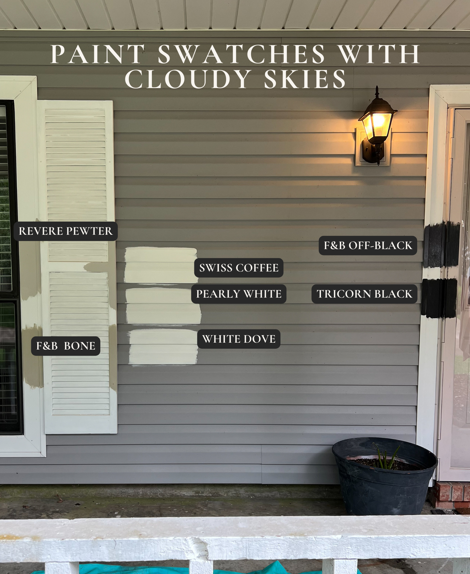
After staring at them for weeks, we’ve decided to go with Swiss Coffee, Revere Pewter, and Off-Black on the door. Neither of us like Bone outside on the porch at all which is wild because it looks so different in our bathroom. Can you see how the Tricorn Black, which is a very true black, would be too stark for the brick color? The last decision we have to determine is if we’re going to paint the trim/porch Swiss Coffee or Revere Pewter. I started mocking it up in Instagram with the drawing tool and quickly leaned towards doing it all white and then just doing the trim and shutters around the windows Revere Pewter. Potentially the garage door too… We’ll see. Here’s my really poor drawing that I stopped half way because I realized it wouldn’t be worth it for me to keep going. Also, wouldn’t it be so pretty to put jasmine vines in diamond pattern along the garage wall around that window?! That wall has always bothered me. We tried doing a wall of hydrangeas there but the sun and Mississippi heat ruined that for us. If we find out we’re staying here for a few more years, that is one of the first projects I’m going to tackle.
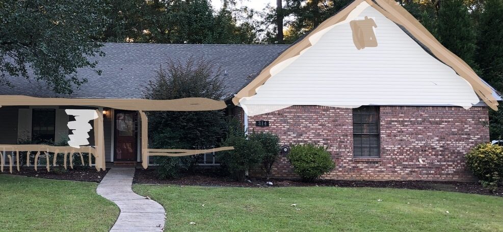
Our painter has been so busy (bless him for working in this terrible heat) but he hopes to start on the project soon. I’m excited to share the progress with you!
jordan jean
What is the exact roofing shingle you have selected as your inspo ?
I just grabbed an image off of google images at the time that looked similar to what we had existing so I can’t say exactly.
Where cm I see pictures of house completed with new paint colors?
The post is coming!
I picked out the same colors! I would put shutters on the garage window. It looks too small as is.
Yes! I do think it would beef it up a bit! Ideally we’d actually remove this window, fill it in with brick and add 2 windows to make it more symmetrical but since we plan on using this as a rental, we don’t believe it is worth the work to do on this house.