June 27, 2024
This post is sponsored by Livette’s Wallpaper. However, all thoughts/opinions on my website are always my own.
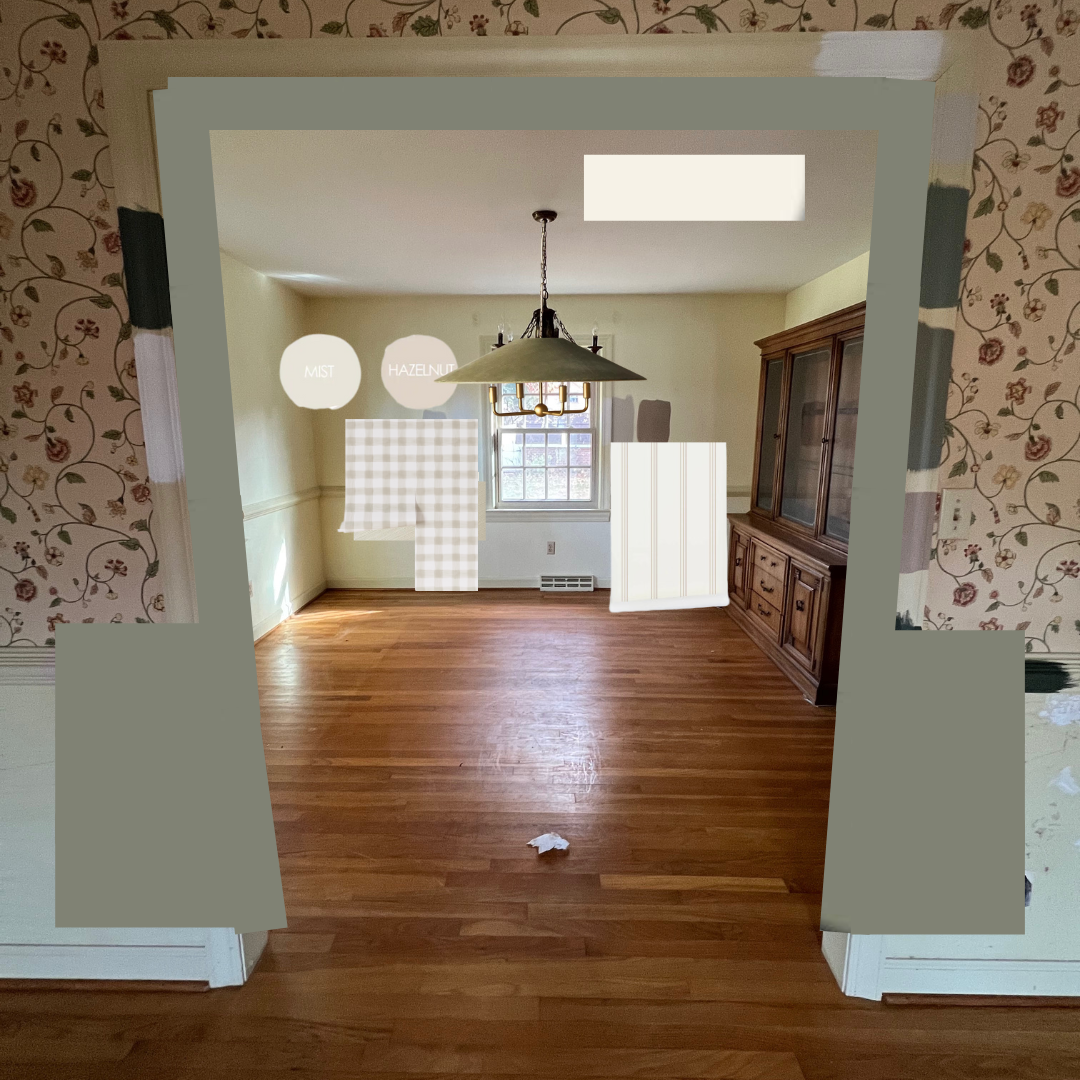
Our first finished room in our Virginia home!!!! I am so excited to share this one with you particularly because I have been envisioning this space since before we even purchased this house. Let’s face it, I just can’t help it. My brain automatically starts building design boards when I see photos of a space. It’s so much fun. Since this is the dining area we use for every meal and we host meals very often we planned on tackling this room first. The table is the heart of our home! Anyway, we bought this house site unseen (spoiler alert: we have yet to buy a house any other way 🤪) so this was the first time we were seeing it in person. Here’s what it looked like on that brisk, exciting morning (you can see the rest of the house on THIS post):
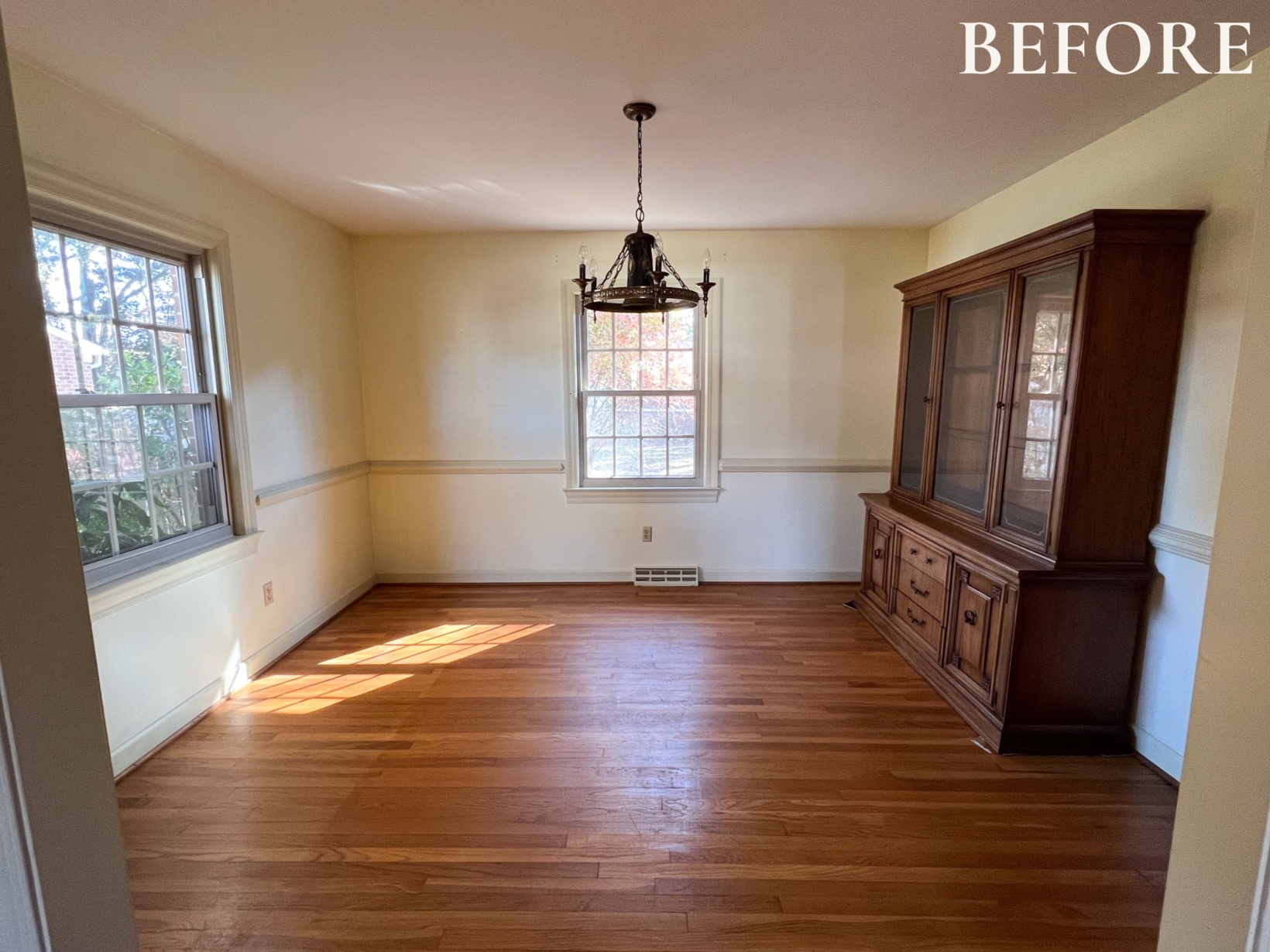
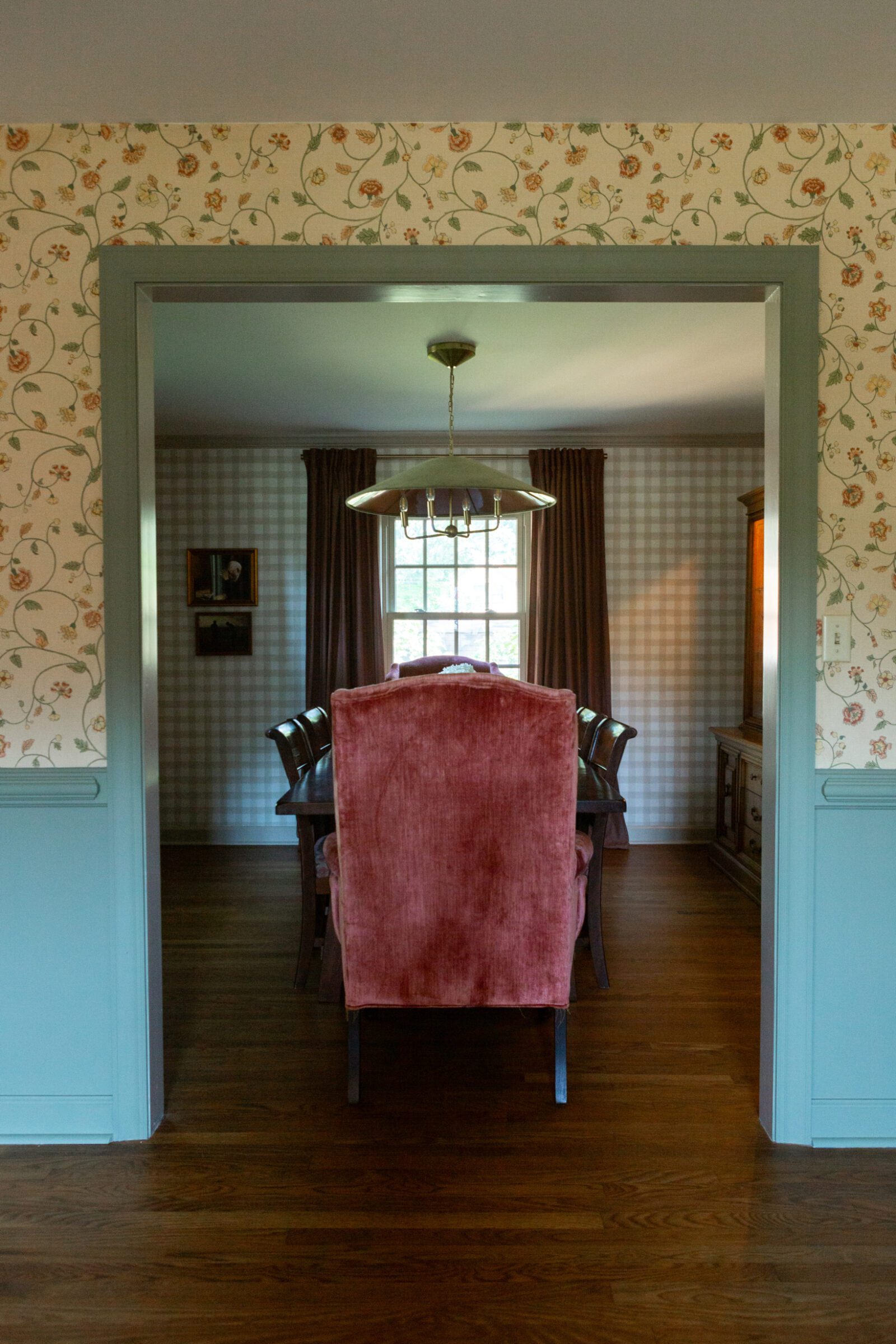
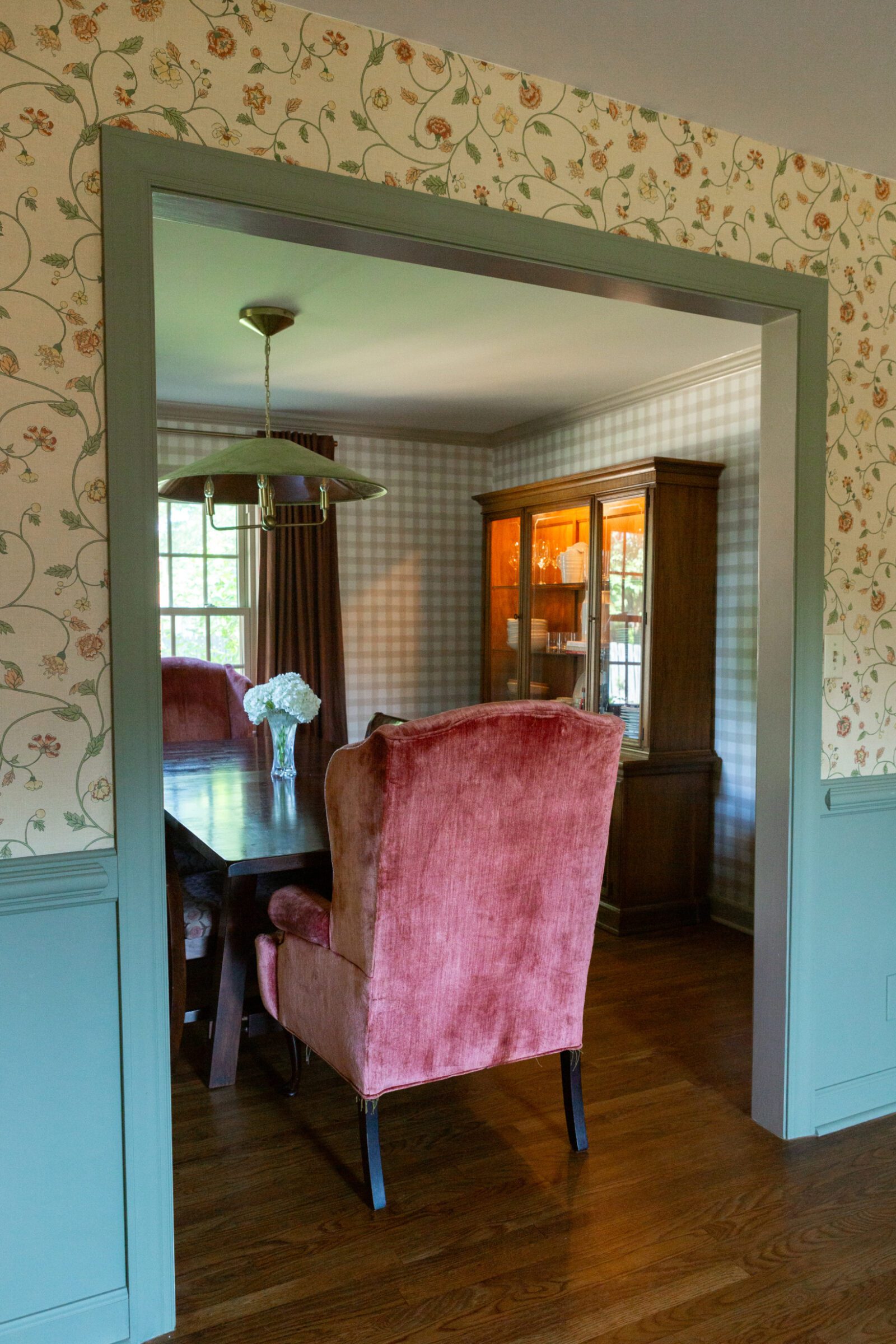
I think it’s important to highlight that the dining room is connected to what I believe the previous/original owners of the home used as the formal living room. We plan to use it as our playroom/homeschooling room! More on that later but I do need to paint the picture (no pun intended) of what we were working with to understand how we landed on our dining room design with the most perfect wallpaper. Here’s what that (now playroom) looked like with the dining room attached:
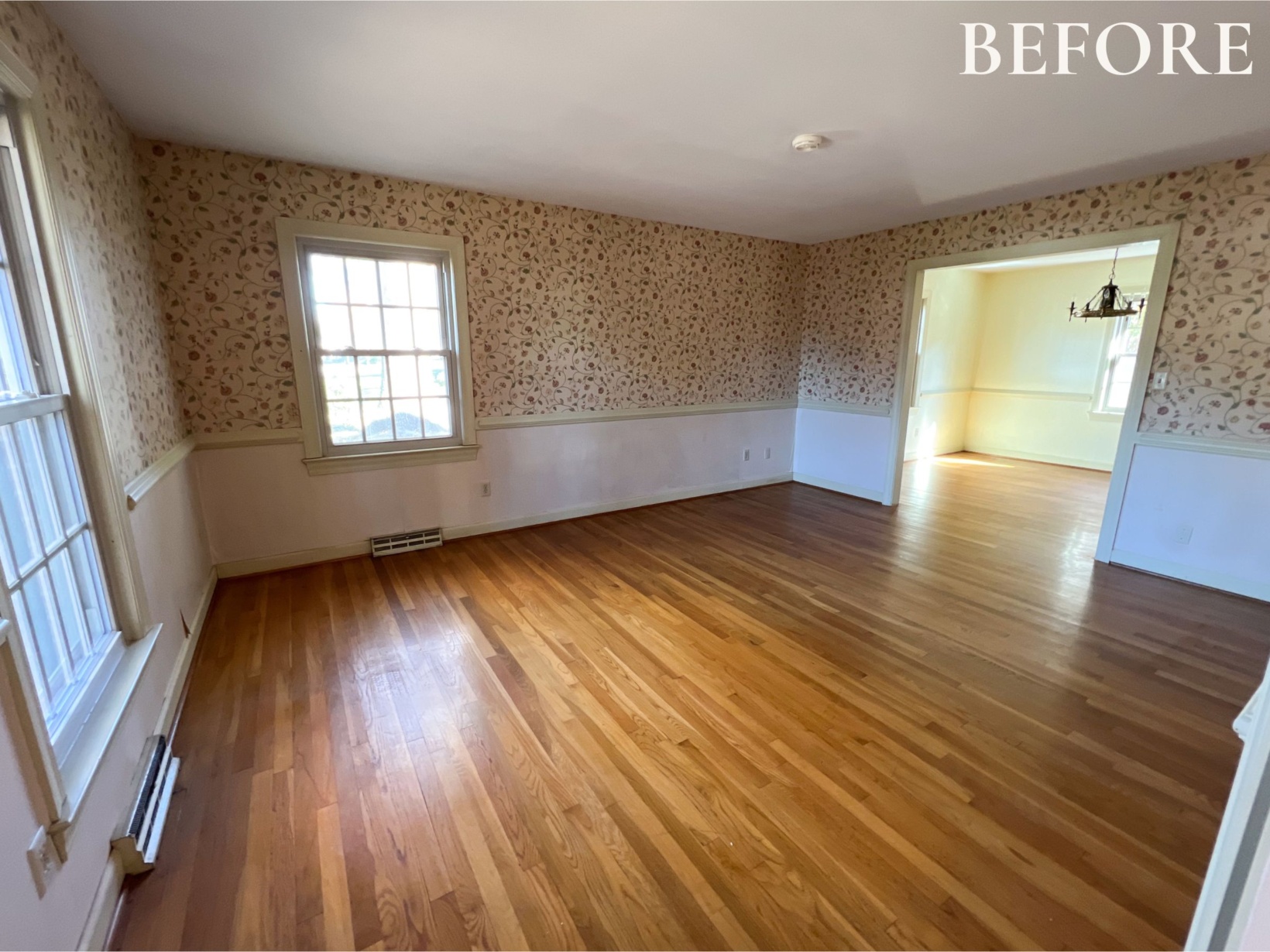
Based on the photos and video tours we received of the house, I knew there was a possibility of keeping the wallpaper in here. However, I knew I needed to wait to see it in person to determine if it was still in good enough condition to keep. Even then I couldn’t stop my mind from dreaming up a design board. If the wallpaper was going to stay, I could work with it and either paint the dining room or use another wallpaper in the dining room to compliment it. In my heart though I knew I wanted to add some more wallpaper… I just absolutely love mixing classic geometric patterns like gingham or stripes with florals and I felt like (more) wallpaper would add even more fun and interest to the house. It would be a way to keep close to the original style of the home (which we really love!) while making it feel a bit more up to date, you know?
Overall the floral wallpaper in the playroom is in great condition. There are some holes and a bit of bubbling in some spots (we didn’t even notice it until living here for weeks!) but they are barely noticeable. It’s a very forgiving pattern. I don’t know if this wallpaper is something I’d immediately lean towards picking today but it is such good quality paper and I figured we could highlight how great it is with a few updates. I’m especially grateful now that we didn’t take it down.
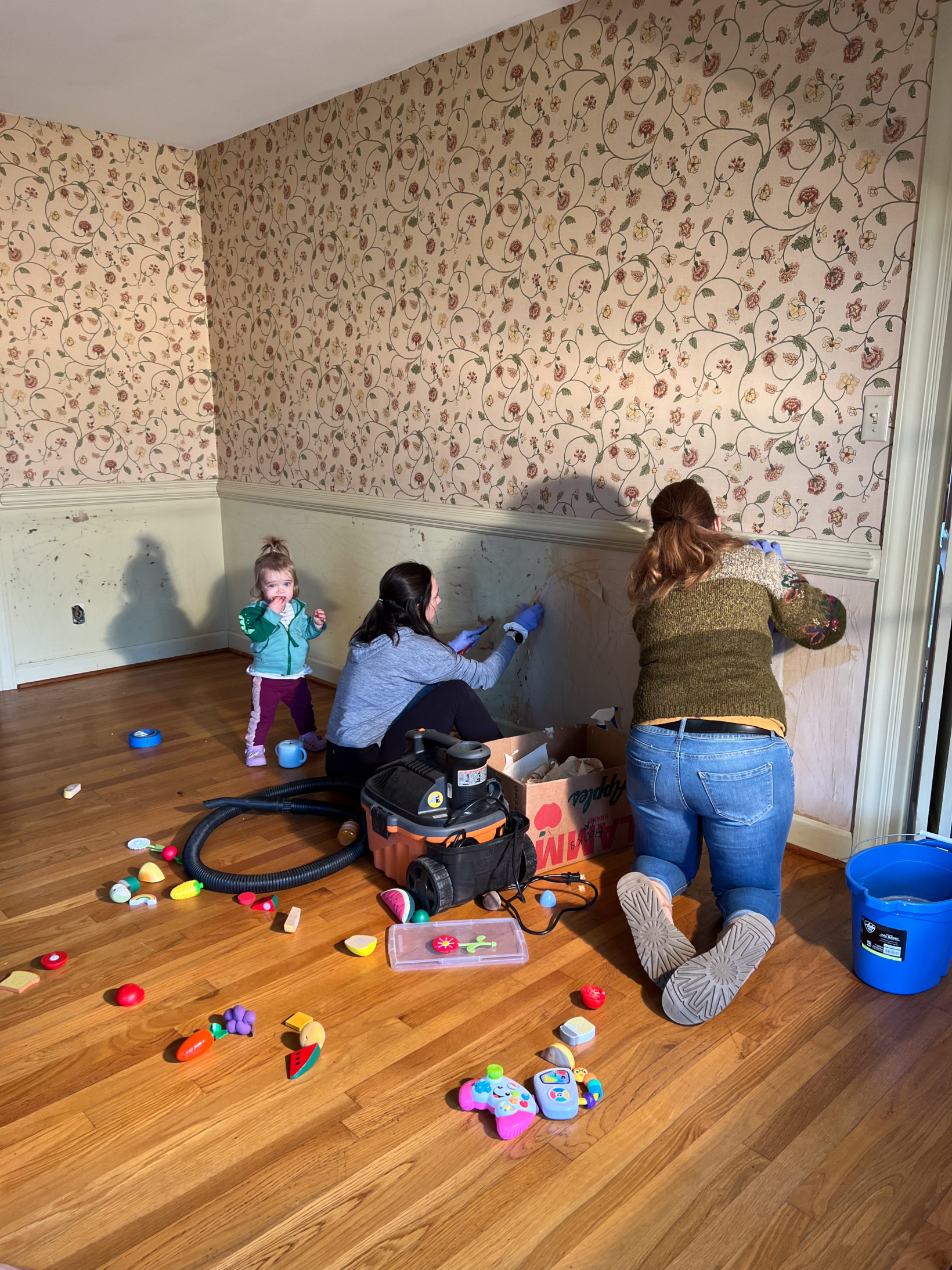
The wallpaper on the lower half though was another story. I’m sure it was beautiful when it was installed most likely decades ago but it had taken a beating so we took it down. In the most typical fashion, my mom and best friend quickly got started on the removal process.
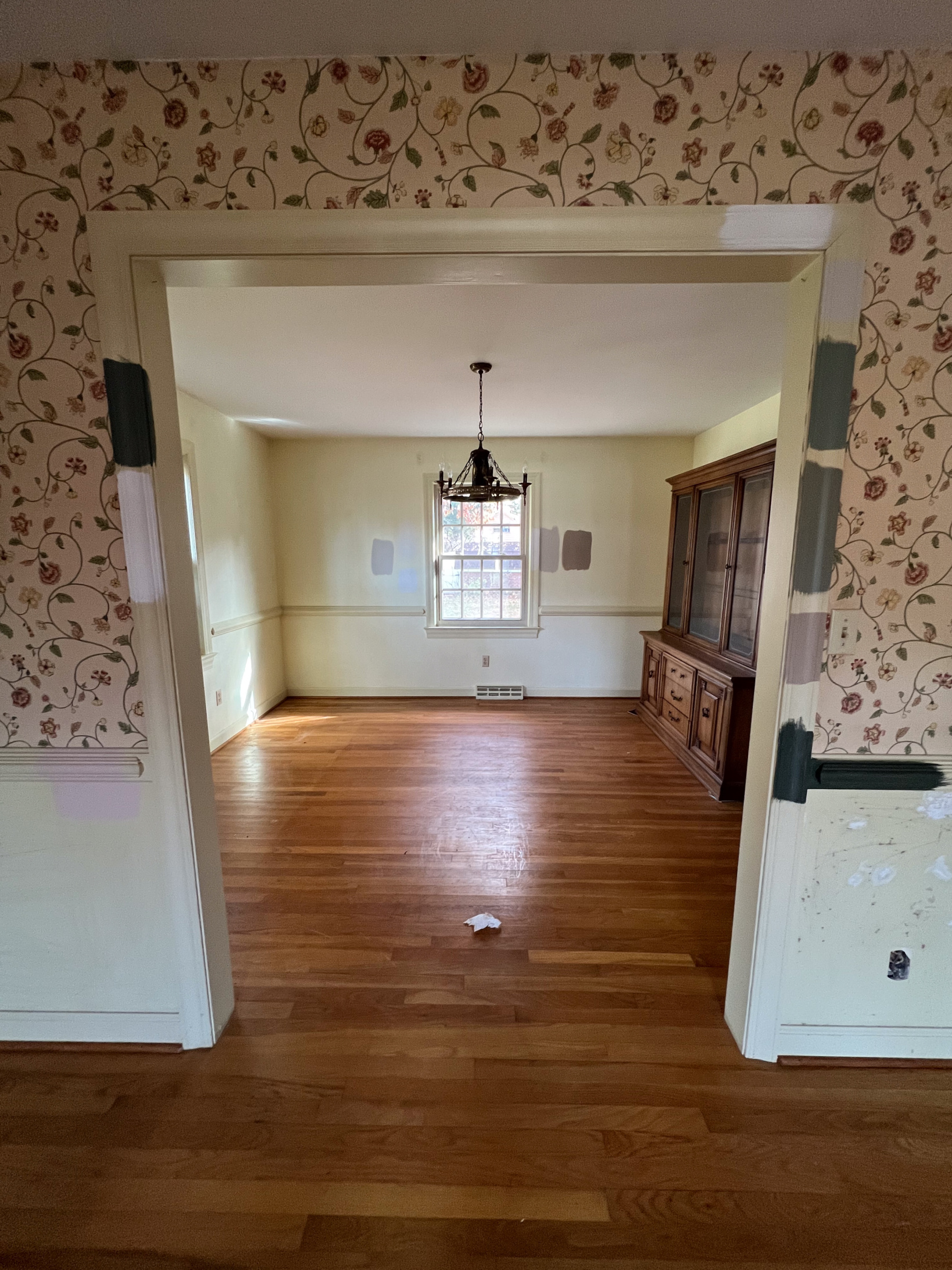
Once the lower wallpaper was removed, I started testing all of the paint samples. Since the rooms are open to each other, I wanted to find something that coordinated but wasn’t TOO “matchy”. If that makes any sense whatsoever? This wallpaper changes color quite a bit depending on the lighting so finding a color for the lower half of the wall and trim was interesting. After trying multiple samples in the dining room to compliment it, I didn’t like any of them at all. Since this trip to the Virginia house was only for a few days, we had to leave it at that and return to our Mississippi home for the next few months before permanently moving into this house in Virginia. This meant that I had about three months to stew over what to do…
On the 15 hour drive back to Mississippi, Stephen and I made the decision to wallpaper the dining room. I knew that even if I tried a dozen more paint colors, I wasn’t going to like it. It wasn’t going to be fun or interesting enough unless we added some sort of wall treatment. My mind was set on gingham, buffalo check, or stripes so the search was on. Once this blueprint for my plan was set (and Stephen liked the plan) there was no stopping me. I’ll just tell you that the combination of my brain always imagining these spaces and postpartum meant I was sitting or laying down often messing with this design board and searching for wallpaper constantly. It’s not pretty at all but here’s the gist of what my Canva design look like at any given moment. I dragged prints, lights, colors in and out of the image to see if I liked it or not until it clicked. “Hate it until you love it” is something I think often about things like this.
I was not only on the hunt for wallpaper but also the trim and lower half color for the playroom. Based on the samples I tested, we eventually decided on the color Treron by Farrow & Ball, a beautiful shade of green. I figured I had to decide on that first before nailing down the wallpaper. Over the next couple of months I probably tried over two dozen wallpapers in my design plan. I had found a few gingham prints that I loved but was nervous that the color wouldn’t pair well with the playroom wallpaper until I came across Livette’s wallpaper…
YOU GUYS. Let me start by saying that this company and their customer service is absolutely phenomenal. I had no idea about that at the time of course… I just knew that I had found multiple wallpapers on their site that I really liked and thought could be great in the dining room. I was immediately drawn to this wallpaper but didn’t want it to be navy in color and then I saw all of the available color options and even the availability to order a custom color. What a GAME CHANGER! I started talking with their customer service team about my plans and thoughts with the playroom and eventually ended up ordering multiple samples all of this wallpaper from their elegant neutrals collection. I ordered the colors linen, hazelnut, taupe, and clay in the traditional and peel-and-stick materials. Even though they’re shipping from overseas, it shipped in a very timely manner. I think they arrived the day after we moved in and I remember being so excited I could barely contain myself.
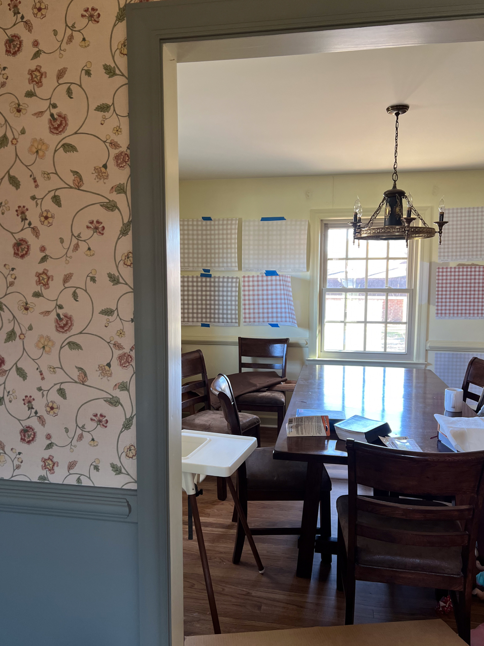
I mentioned that they can make custom colors and while I think it would’ve been so awesome to do that, I didn’t have a wallpaper sample of the playroom wallpaper that I could ship to them. Colors in a picture taken on the phone/camera will inevitably be skewed from the initial photo or sending/printing of the photo so I figured it would just be best to choose one of the options they have. There are so many! As soon as we got them up, I was able to narrow them down immediately. The samples are SO helpful and they’re large so it’s easy to get a good idea of how it’ll look in a space. We kept them up for a couple of weeks and it was so fun to hear all of our guests weigh in with their opinions.
I knew immediately that we’d use the traditional material. We’ve used both traditional and peel-and-stick in the past for example here, here, and here and really don’t prefer one over the other in terms of install. It is mentioned on their website that the peel-and-stick tends to be a bit more cool in color. I found that to be the case especially with the white. However, the peel-and-stick was such good quality, durable, and thick. I can’t emphasize that enough. You’re definitely getting what you pay for! As for the colors, I immediately narrowed it down to hazelnut and clay (upper left and bottom right on the left side of the photo above). The clay pulls in from the flowers of the playroom wallpaper. It was so fun! I had Stephen share his thoughts before I mentioned any of mine. We love seeing if we’re on the same design wavelength. Sure enough we were! The linen (upper right) didn’t provide enough contrast, the taupe (bottom left) was too gray looking with the playroom wallpaper, and he just liked a more neutral option so his final decision was hazelnut. Sure enough that was mine too. I had decided that within about 45 seconds of seeing it up on the wall and taking a step back. It’s SO BEAUTIFUL!!!
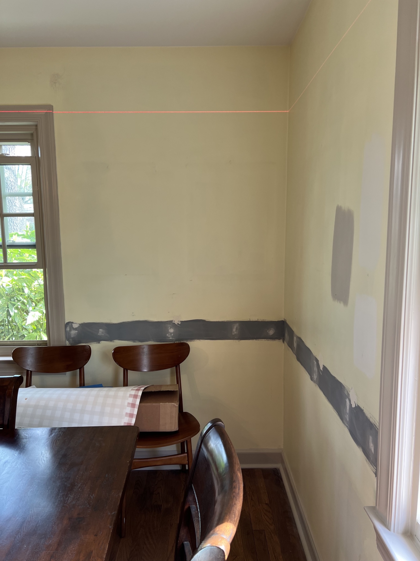
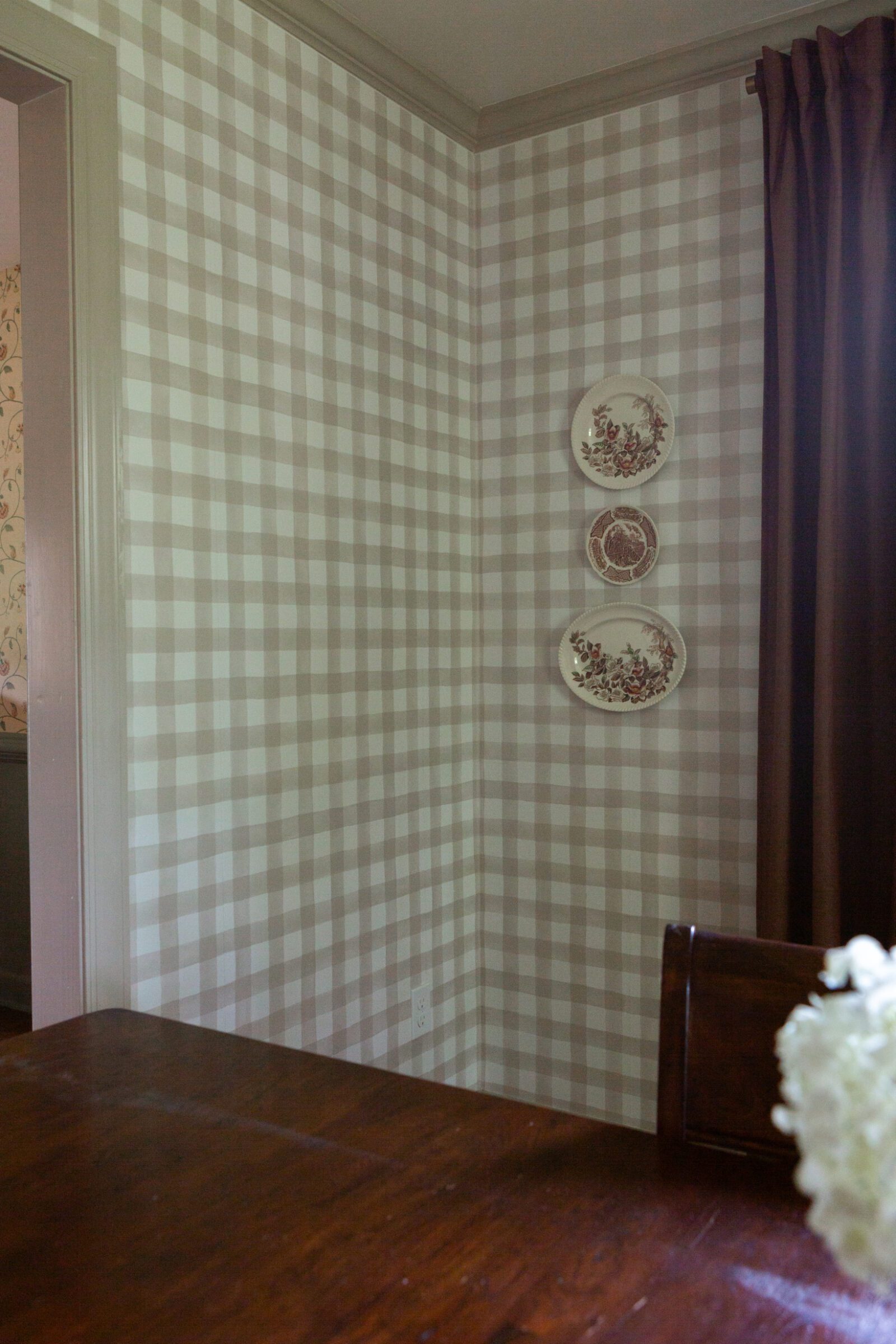
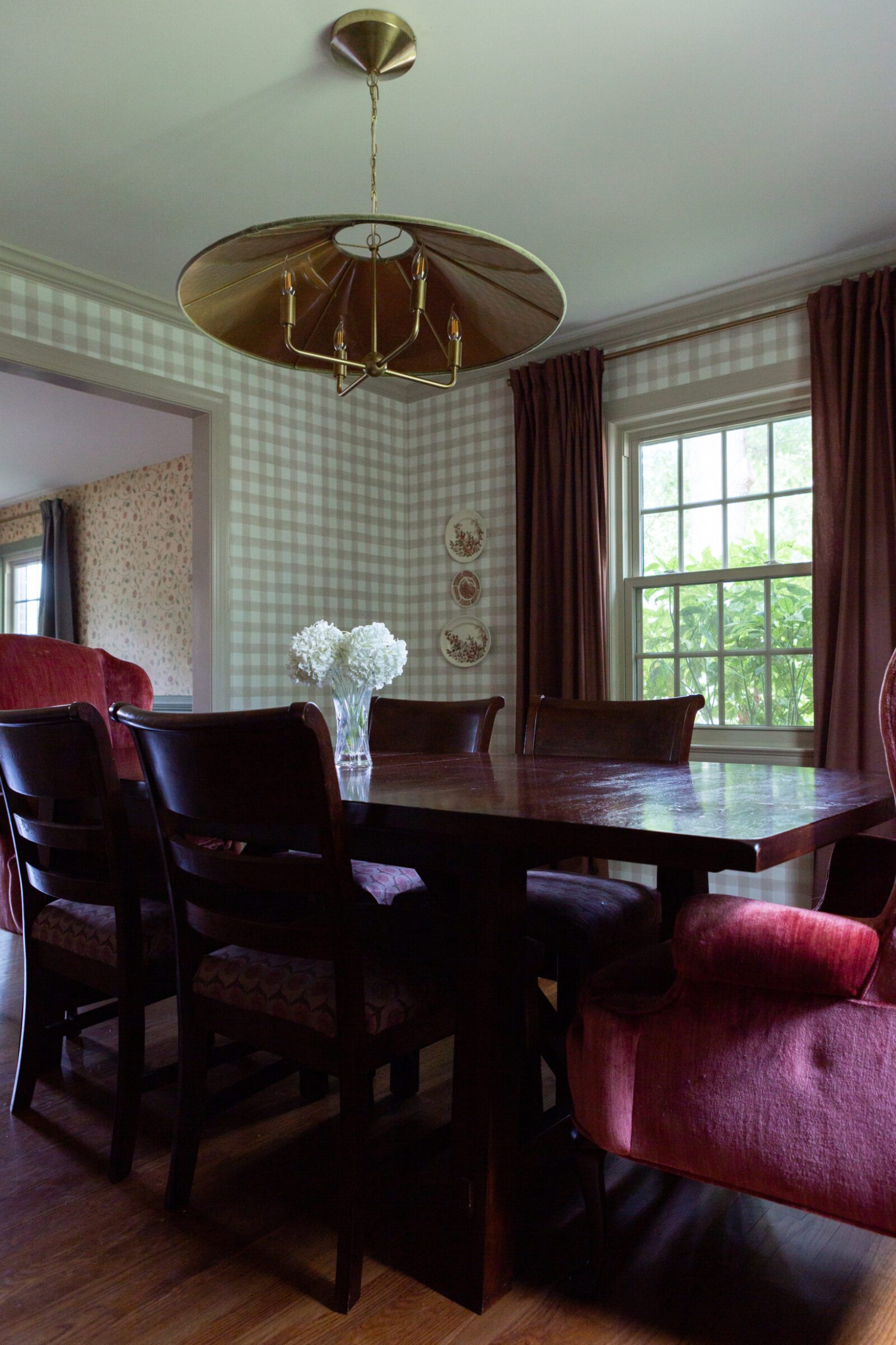
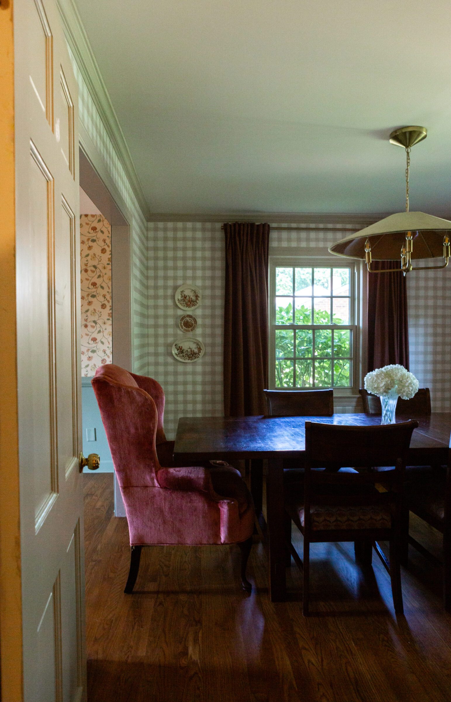
Another big plan I had was to remove the chair molding in the dining room. I’m sure some people are gawking at the sound of that because I will agree, it is very beautiful molding. However, since we were keeping the molding in the playroom, I didn’t want them to match with wallpaper on the top and paint on the bottom. I also didn’t want to break up the wallpaper with the chair molding running across it. Looking back I have absolutely zero regrets with that decision. Taking the chair molding off and running the wallpaper the entire length of the wall makes the room look so much bigger. Our friends that have been here tons even made comments about it the first time they saw it up! “The room looks so much bigger now!”. We had the color and material nailed down but a little concern we had looking at the samples was the size of the pattern knowing that we would cover every inch of the walls. It was going to feel too stimulating. This is where Livette’s awesome customer service comes in.
I reached back out to them letting them know my concerns. They asked me for the dimensions of the room and their designer got back to me saying that this wallpaper, the one that immediately caught my eye on their site, would be a winner because it has bigger squares. Instead of ordering another sample we trusted them and customer service helped us make sure we ordered the correct amount in the color Hazelnut and traditional material for our 11.5’x13′ room. The wait was on!
In the meantime, we removed the chair molding, patched it up so that the walls were smooth, primed that section, and went through our process of painting the (oil-based) trim – sand to remove as much paint as possible, fill holes, sand, prime, and then paint. After a lot of debate I ended up going with Benjamin Moore’s Smokey Taupe in a semi-gloss finish. It is *almost* a perfect match. However, in certain lighting I notice a tiny difference (it’s really so close it doesn’t bother me at all). I asked Livette’s customer service if they knew of a “perfect match” color wise just for purposes of sharing the info with you on here and they recommended swatching Sherwin Williams Worldly Gray. I can’t speak on it because I had already gone with Smokey Taupe but it might be worth trying!
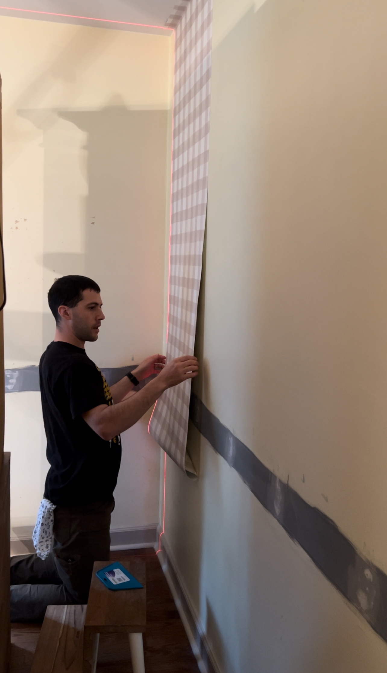
I was giddy the day FedEx showed up with our package. Stephen and I unboxed the wallpaper together and were really impressed with how it was shipped. Instead of one long roll of wallpaper like we’ve used from other companies, Livette’s sent the wallpaper with pre-cut panels that had some extra length on each so that we could make it perfect for our room (no room is perfectly square!). The panels were packaged in sturdy tubes to ensure the wallpaper wasn’t damaged.
Not long after, we started to install the wallpaper together. I call this free marriage counseling. I was in charge of putting one panel on the table, adding wallpaper glue, and book ending it to rest while Stephen hung another piece. We started on the wall behind the hutch a few inches away from the corner. That way when we finished wallpapering the entire room and the pattern didn’t match up exactly right (it pretty much never will), our adjustments wouldn’t be super noticeable. Never start directly ON a corner! It makes it so much harder to adjust on the last panel. We always add a few extra inches at the top and bottom when installing that way we can cut off any extra paper with a sharp razor blade. I do this by using a flat edge with my razor blade and running it along the trim. Make sure to also buy extra razor blades. It’s important they are super sharp so that you don’t rip the paper. We worked this way until mama duty called and Stephen ended up doing the rest of the room on his own. It took him probably about 10 hours to finish total? While getting snacks, breaking up fights, or even changing a diaper from time to time. It’s almost important to note that he’s a serious perfectionist when it comes to this kind of thing. I asked him what he thought about the installation process and he said, “I thought it was easier than others. It was nice and sturdy and didn’t rip and didn’t get blown away when applying it.”
Overall the paper is such great quality. Like I mentioned earlier, you’re getting what you pay for. It is thick and not likely to rip (we have had this happen with cheaper paper). It’s also super easy to clean and wipe down with a wet cloth if you use too much glue or kids throw food/get their dirty hands all over it. We were a bit nervous that the dark primer we used on the chair molding area would show through but it doesn’t whatsoever. The peel-and-stick wallpaper requires one less step because of the glue but overall we’re glad we went with the traditional material because we like the creamy white background it provides. This larger gingham pattern is so perfect in here. It’s not too busy whatsoever. The hazelnut color compliments the playroom wallpaper and adds so much more interest into the space. Try to imagine the same room with just solid colored walls. It just doesn’t compare, right?! We don’t think so. The wallpaper 100% makes the room and I’m sure this will not be the last time we use Livette’s wallpaper.
It took me quite some time but we finally found a light that we loved in here. We wanted it to make a big statement while remaining true to the house style wise, and also pulling in elements from the wallpaper in the playroom. It was a big ask but I searched and searched and finally found this one. We think it’s pretty darn perfect in here and love how it looks especially from the view from the outside or in the playroom!
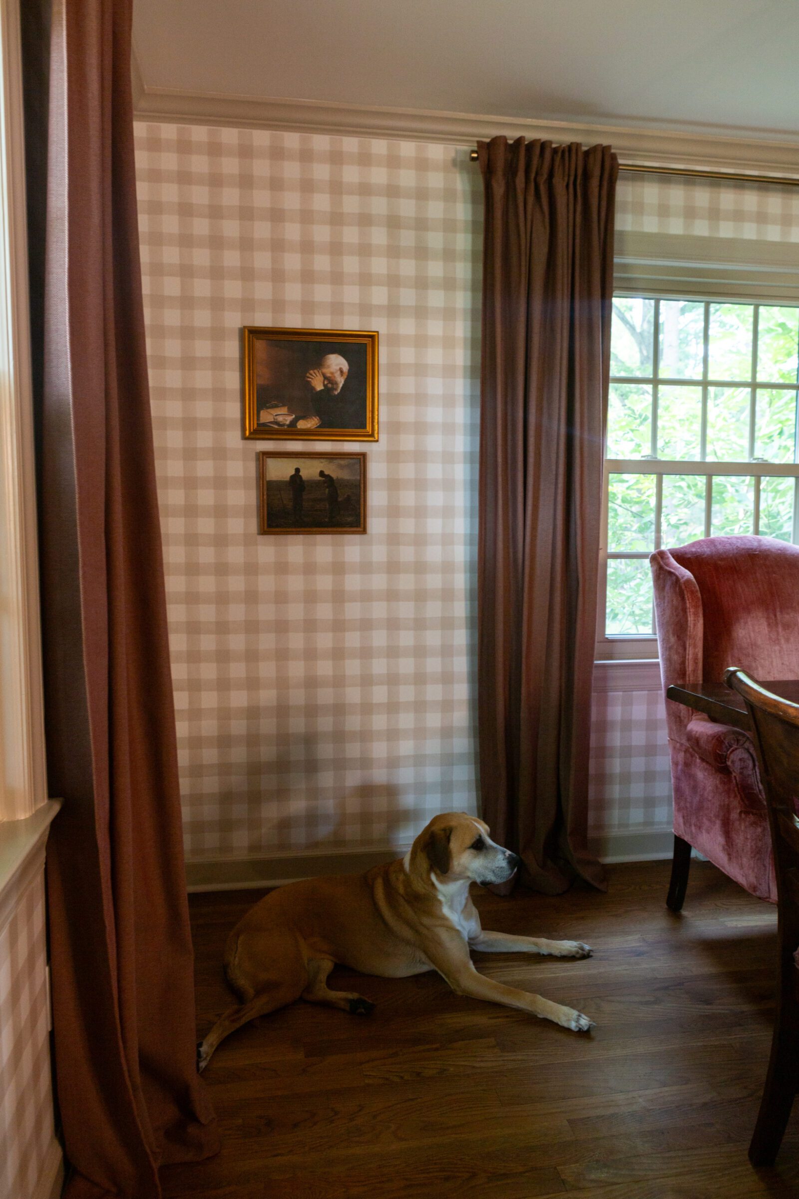
To finish off the room, add some more character, and make it look more finished, we added crown molding that we painted in the same color as the rest of the trim.
Let’s talk about this dining table. It wouldn’t be something that I’d typically choose. I tend to like something with more curves, character and a vintage feel. However, Stephen was very particular about the size of table he wanted in here. It’s something he has been talking about for quite literally years. We’d host large groups in our Columbus kitchen and bless all of our friends… We’d be like sardines packed around that table with a card table next to it. We also know we want a big family and praise Jesus our own family is taking up quite a bit of seats at this point! Large tables though can cost thousands of dollars so we searched marketplace for months before finding this one. It’s solid wood and can fit 10-12 people with all of the leafs in. The best part is the chairs are so sturdy. Even though they’re not supposed to, the kids will stand up on them from time to time. After watching them tip chairs in our Columbus kitchen, sturdy chairs became a need. Functionality (and safety) in this season with a bunch of little kids is the main focus but that doesn’t mean we can’t put our touch on it, right? I felt the cushions needed some more contrast and just more interest in general so I decided to add another fun print into by the room by reupholstering them with this fabric that Stephen and I both liked from Spoonflower. I ordered it in the cypress cotton canvas material. It is easily wipeable and the print hides just about everything. Always keep your eye out for sales on their site! They also offer military discount. I might decide to refinish the table someday but I will admit I’m still tired from this project even 6 years later so we’ll see. Ha!
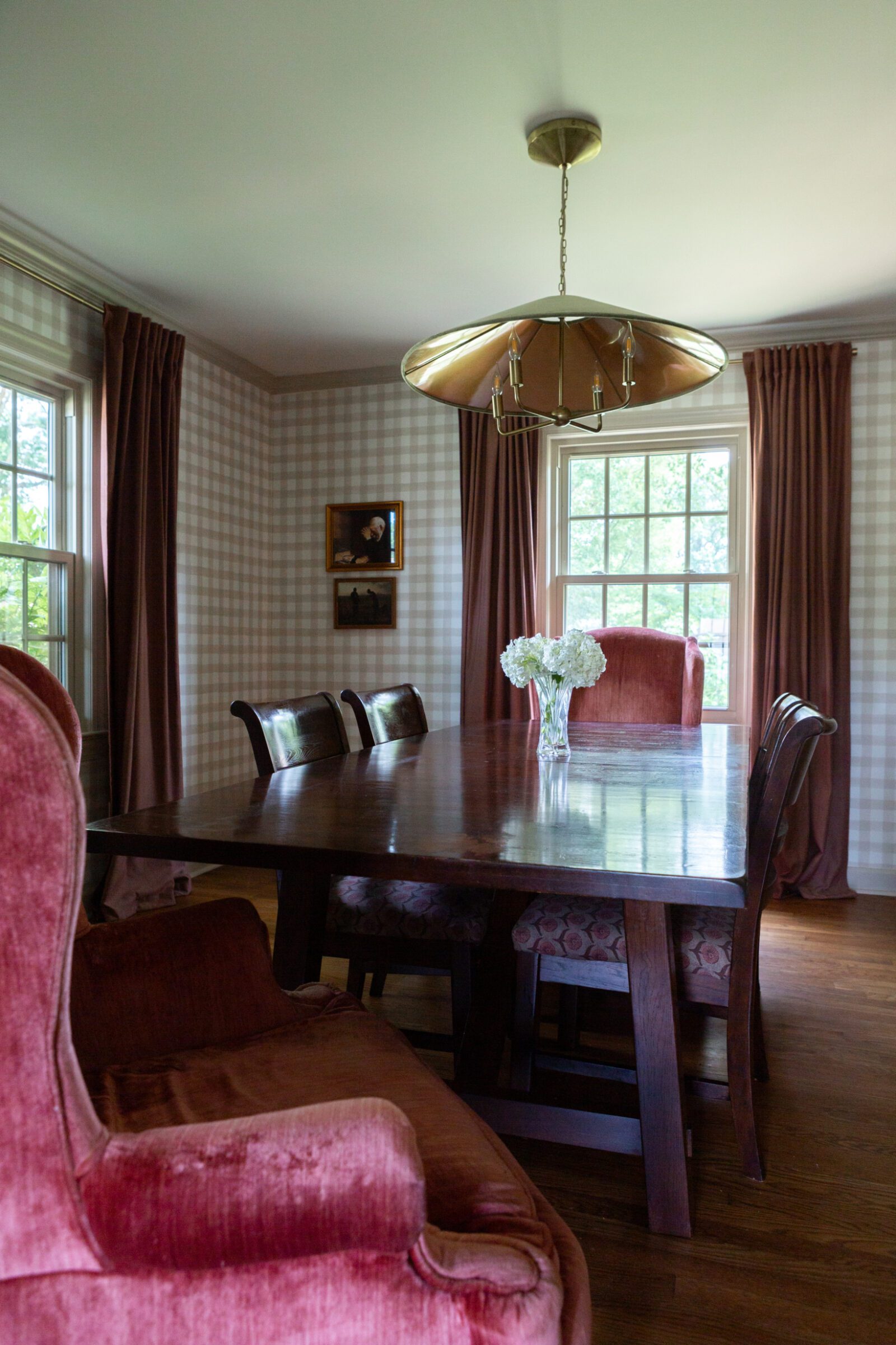
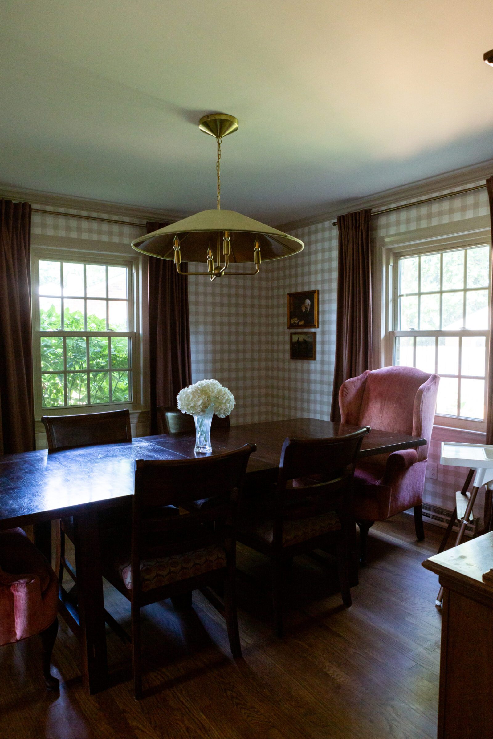
I found these velvet chairs on marketplace before we even moved here and thought they would be perfect in the playroom. When Stephen saw them he said, “pink chairs, seriously?!” and then realized how comfortable they are and he’s come to really like them. We used them constantly in the playroom but we also realized after hosting so much since living here that we frequently run out of chairs. I decided to pull them in here just to see how they look and love the color and texture they add. We just turn the chair around when we need it for the playroom. They also look great with the new fabric on the dining chairs and serve as another mode to pull in colors from the playroom.
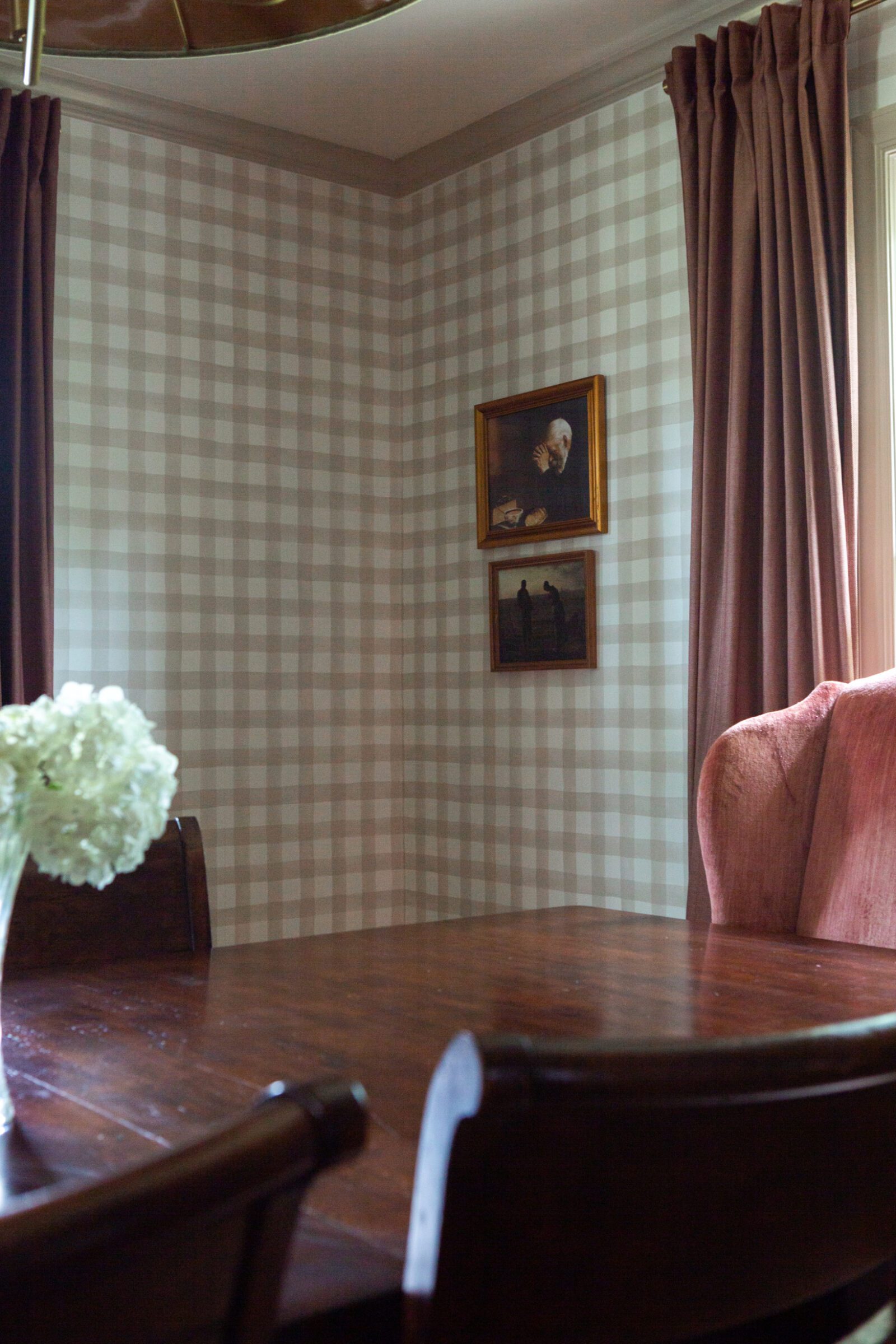
I have to tell you about this hutch! Our amazing realtor bought it from the previous homeowners for us as a gift. It was so incredibly sweet of her. I have to admit, for a minute I wanted to paint it. *GASP*! I actually even sampled this stunning cranberry colored paint ON IT that I later removed after my good friend Nikita talked me off the ledge. She gave me a beautiful rundown about how she was going to paint her own hutch but decided not to and she’s grateful every day that she didn’t. I’m grateful she didn’t either! It’s so timeless. She convinced me to not paint mine and I am so stinking glad that she did and that I listened to her. The specific wood tones of the table and hutch initially bothered me together but once the wallpaper was up, I started styling the hutch, and we added the dark red curtains, it came together.

I kept the artwork in here pretty minimal because I think the wallpaper serves as artwork on its own. However, when I was at my parents house last I noticed the colors in my great grandmother’s China that my mom has displayed in her hutch. I asked if I could use it as artwork in here. The colors are so perfect! I also love that it’s something my mom also has on display in her own dining room. How special! As for the paintings, the praying man moved with us from our Columbus kitchen. I paired him with a “The Angelus” painting which I love so much. The dining table, and therefore this room, is the center of our home. It’s where we gather together every day, multiple times a day, to not only enjoy a meal together but also to learn, disciple, welcome others to break bread in fellowship, and grow together in our walk with the Lord. Prayer is at the core of that walk for us; no matter how busy we are with parenting, serving, playing, or working. These paintings serve as beautiful reminders of that.
There you have it. Our first completed room in our Virginia home. Thank you so much for sponsoring this post, Livette’s Wallpaper, and for creating such beautiful wallpaper that amplifies our spaces! The view from the front of our house makes us so happy to see the playroom and dining room combined. It’s going to look even better once we finish off the playroom but for now we think it’s pretty darn great. Thank you so much for being here today! Leave any questions you have in the comments and I’ll get them answered!

I sincerely appreciate you all shopping through my affiliate links like the ones included in this post. I make a small commission when you purchase through these links at no extra cost to you. These funds help support my family and allow for us to produce better content for you all. I can’t thank you enough for supporting all that we do!
jordan jean
Leave a Reply


It looks SOOOO GOOD!! The Chairs are awesome! I’ve been searching for new wallpaper for our long entry/family room wall and have had zero luck so far. I need to check this company out!