September 25, 2018
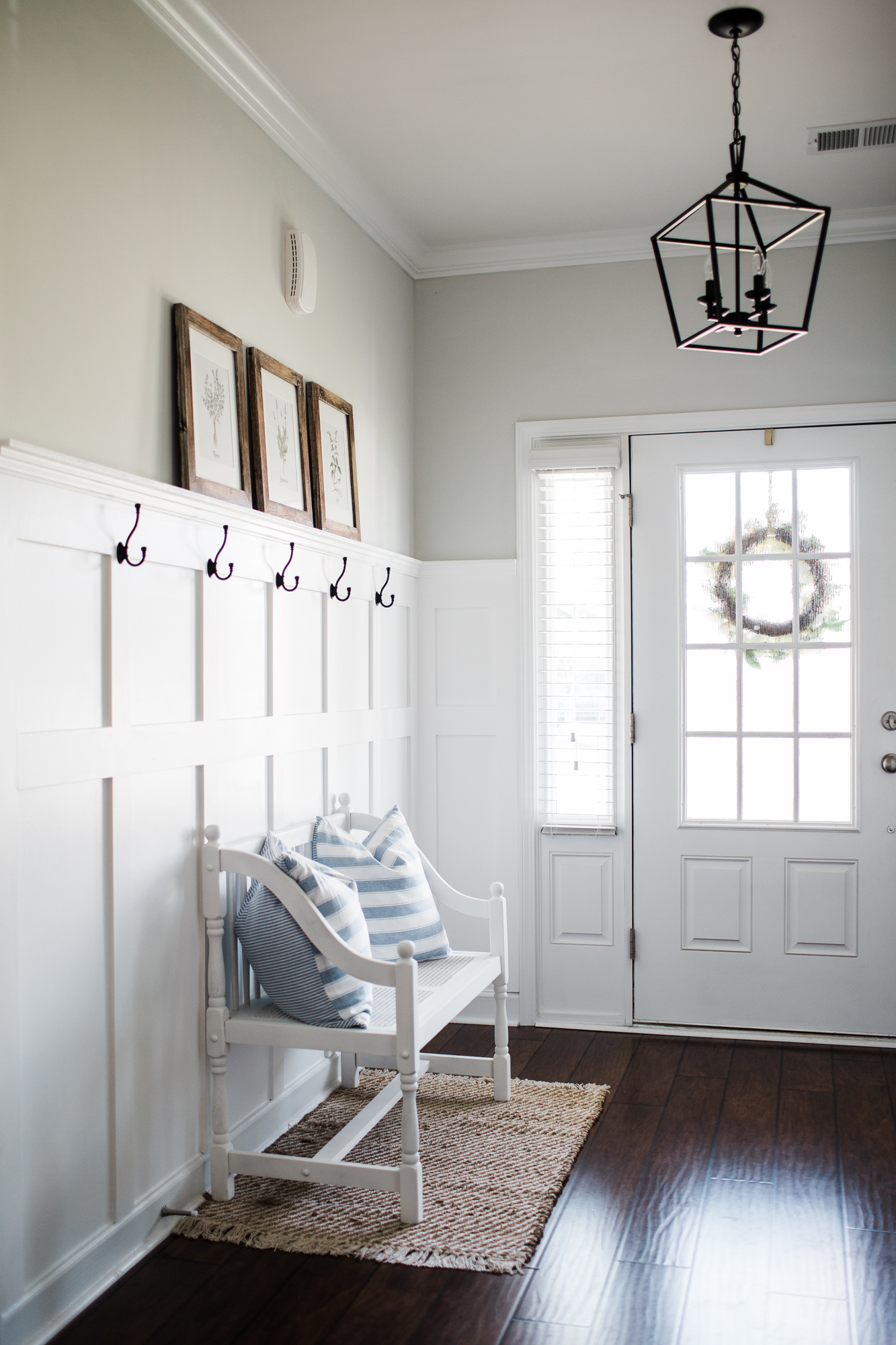
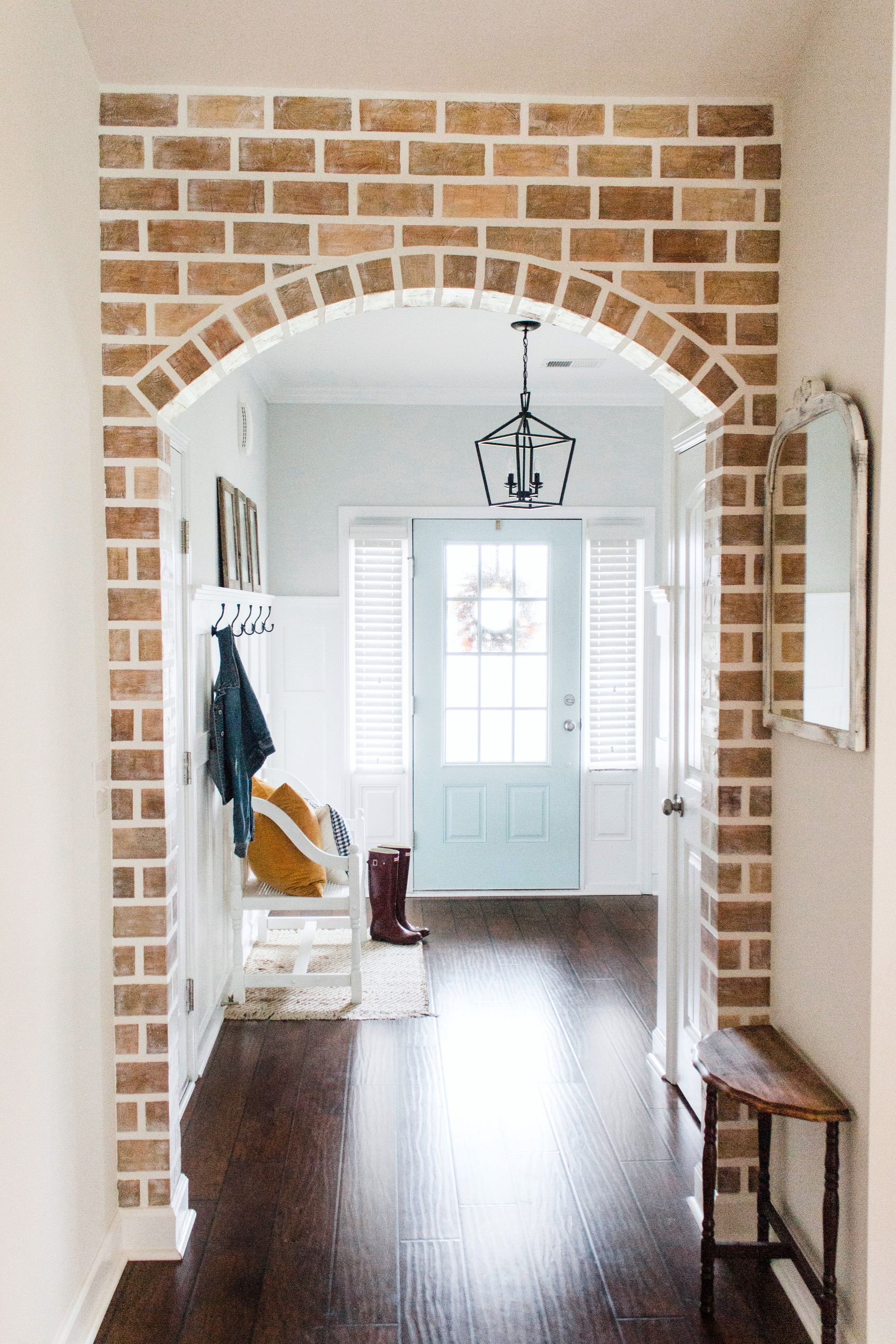
Happy Tuesday! After we completed our board and batten in the foyer, I thought it would be cute to paint the front door to provide a little bit of contrast in the space. Don’t get me wrong, I love white but I craved some color in order to make the board and batten pop a bit more. See what I mean?
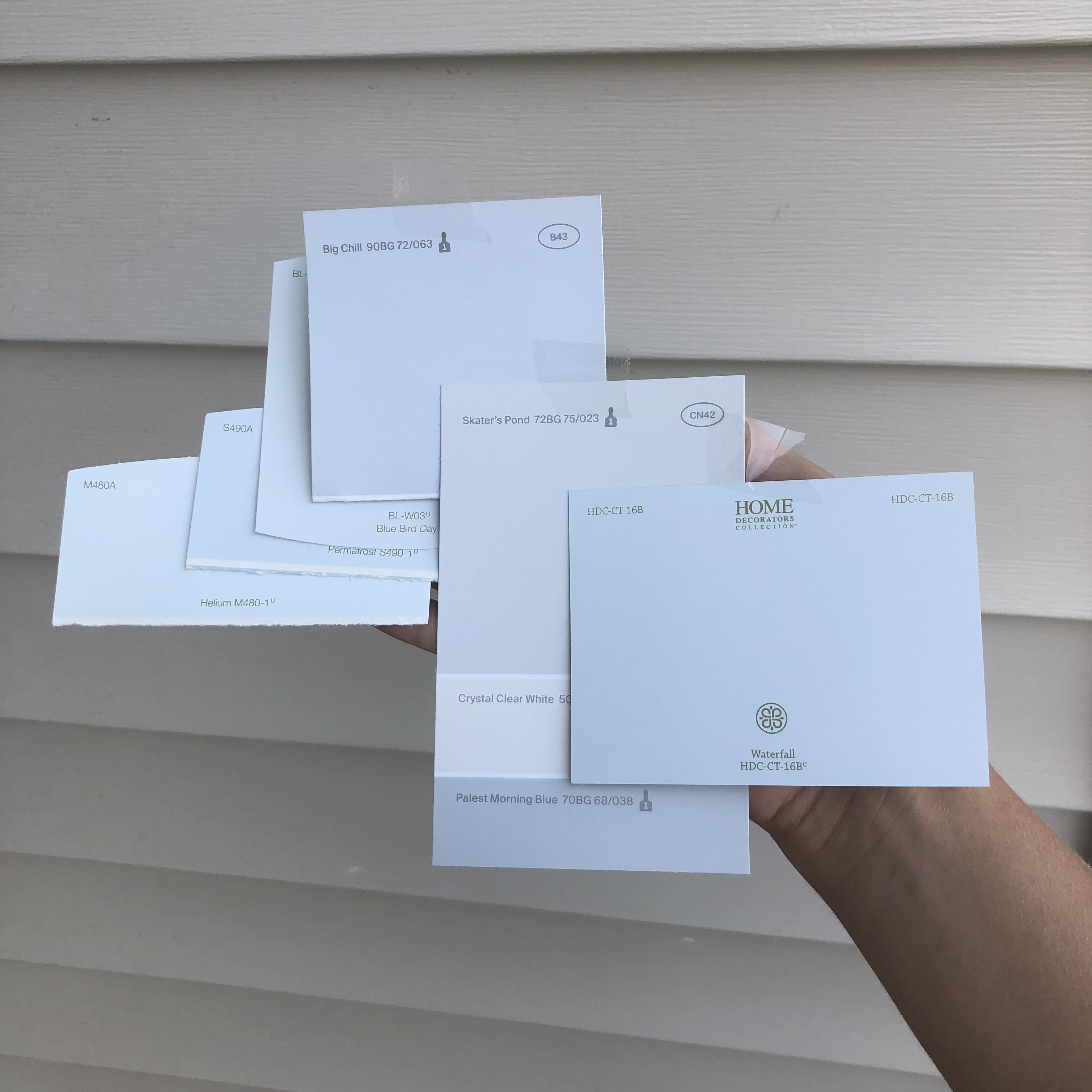
Stephen agreed that a different color door would look good in there so one Sunday after church we stood in front of the blue-ish tones in the paint aisle at Home Depot for about 30 minutes before bringing home about 6 pale blue/teal contenders + 2 navy. We knew we wanted something blue. We just thought it would be more fun than our my typical neutrals and we both love the color so it made sense to us. When we got home I taped all of the samples up on the door and left them there for a couple of weeks. During that time those paint colors were frequently a topic of conversation. Every time one of us walked by them they looked different because of the light so our thoughts on them changed as well.
These are the color options we brought home (plus 2 navy samples) with no filter and photographed outside.
These are the color options on the door with no filter at night (again, no filter on the photo).
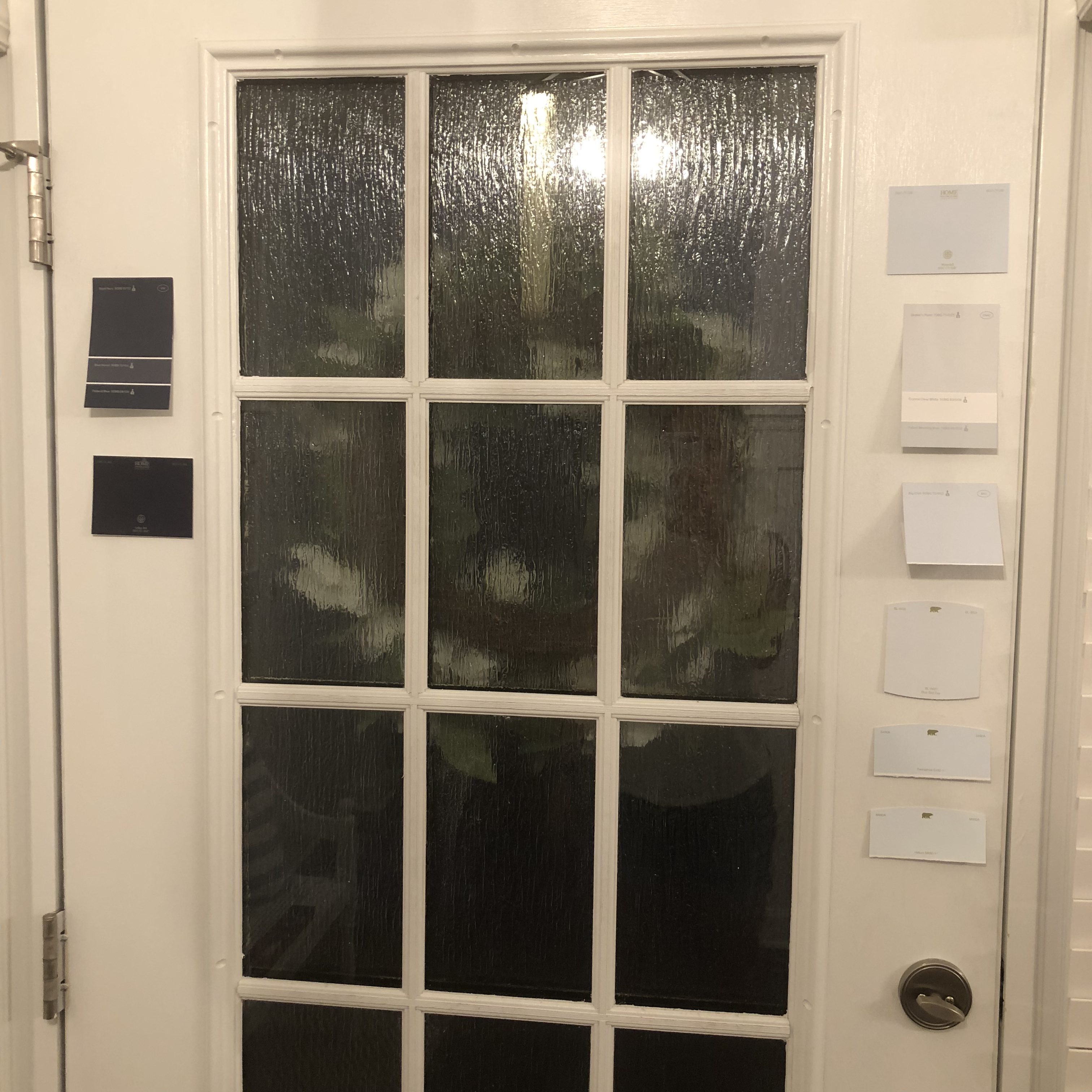
We immediately rejected 3 options and the navy (just because we thought a light blue would be cute) and then talked through the remaining samples. Some of them looked too gray while others looked too teal. Eventually we ended up agreeing on the color Permafrost so I picked up a quart at Home Depot and I started painting…
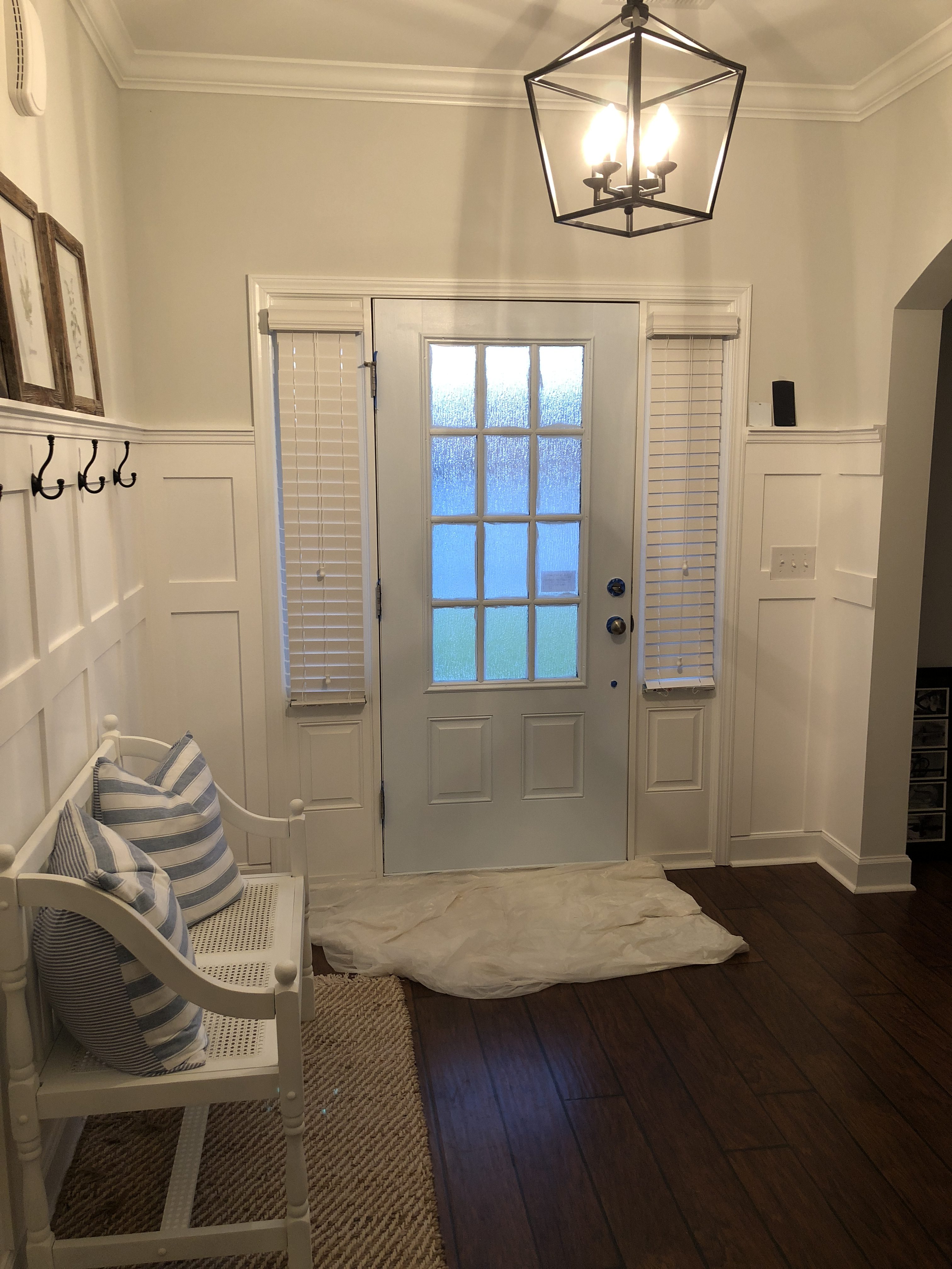
I got the first coat up pretty quickly and immediately when Stephen saw it he said, “Oh…” I was so glad we felt the same way. I thought it was going to be the type of thing where I hated it and he loved it and he’d tell me to leave it because I’d get used to it. I just knew in my gut that I would never get over it. Stephen and I both thought that it was way too “baby blue” for our liking and that was only the first coat…
This is what the paint looked like with no filter and with the overhead light on. It’s not the prettiest picture of course but I want you to see as close to what we saw as possible. The light coming through the windows also makes it difficult to show the real color through the lens. This is the best I’ve got though!
I could barely handle it so of course, I started to come up with a plan for a new color. I still had a blue shade in mind but wanted something a bit more on green side of things vs. baby blue-y so I searched all over Instagram and Pinterest for doors that I loved. Mind you, every door is going to look different depending on the lighting (what time of day the photo was taken, how much natural light is around, etc.) but I thought I’d take it a step further than paint chips and actually buy a couple of samples so that’s what I did.
The three samples I picked up this time were:
- Behr Whipped Mint
- Behr Whipped Mint (75%) – if you didn’t know, you can have a color made up with less saturation so that’s what I did with this one.
- Benjamin Moore color matched Sea Foam in Behr
After paint a section of the door in each color, the Whipped Mint 100% was too dark, the Whipped Mint 75% was too light, and the Sea Foam was also too light so I decided to make my own concoction to make it work.
What I did:
Using the small sample size containers, I mixed together 1/4 of the 75% Whipped Mint into the 100% Whipped Mint container (3/4 full). To make it easy on yourself, ask the nice paint experts at Home Depot to mix your Whipped Mint at 90% (I’m aware that’s not exact math but it’ll be pretty darn close).
I was able to give this side of the door two full coats of paint only using that one sample size container. That really shocked me!
The only part I taped off on the door was the hardware. I absolutely hate taping off windows so I figured I’d scrape the paint off using Windex and a scraper which always works fine for me. However, it takes forever. Next time I paint this door *angel emoji* I’ll DEFINITELY be using this method.
Here’s the finished product! I will say, this color is like a chameleon. Sometimes it looks much darker, other times it looks much lighter. It all just depends on the lighting!
Be on the lookout for the faux brick arch tutorial coming this week. Oh and if you decide to paint your door Whipped Mint don’t forget to tag me so that I can see!
jordan jean
Where did you buy your hooks?
linked here!
https://jordanjean.com/entryway-reveal/
What is the color of paint on the walls?
Hi! All of the colors and materials used are listed by each room here! https://jordanjean.com/our-home-shaw