January 21, 2019
I am overjoyed to be sharing this reveal with you all today! Stephen and I concluded that out of all of the projects we’ve taken on in this house, this one took us the longest. Our budget, the holidays, and time are to blame for that. It was so worth it though! We love how it turned out and automatically feel joyful when we walk in the room. You may be thinking, “Seriously Jordan? It’s just a bathroom.” YES! It may be just a bathroom but it is our goal to make every inch of this house spark joy. Considering this bathroom does that for us, we feel as though we nailed it.
The challenge with this bathroom was working the existing vanity, light, and hardware into the design plan. I learned the hard way with those things to never start a room without developing a design plan first. Since then, I agreed I will not purchase a single thing for a room without having a plan for the space to begin with. I can’t really blame myself for the vanity color. That was chosen over a year ago and I had no clue at that time how I would design this bathroom. I also just loved the color so I picked it almost immediately and moved on. As for the light and hardware, I could’ve let it be until we decided to tackle this room. Those were on-a-whim purchases and didn’t have enough thought behind them. Like I said, I learned the hard way to not do that again. PURCHASE WITH A PURPOSE!
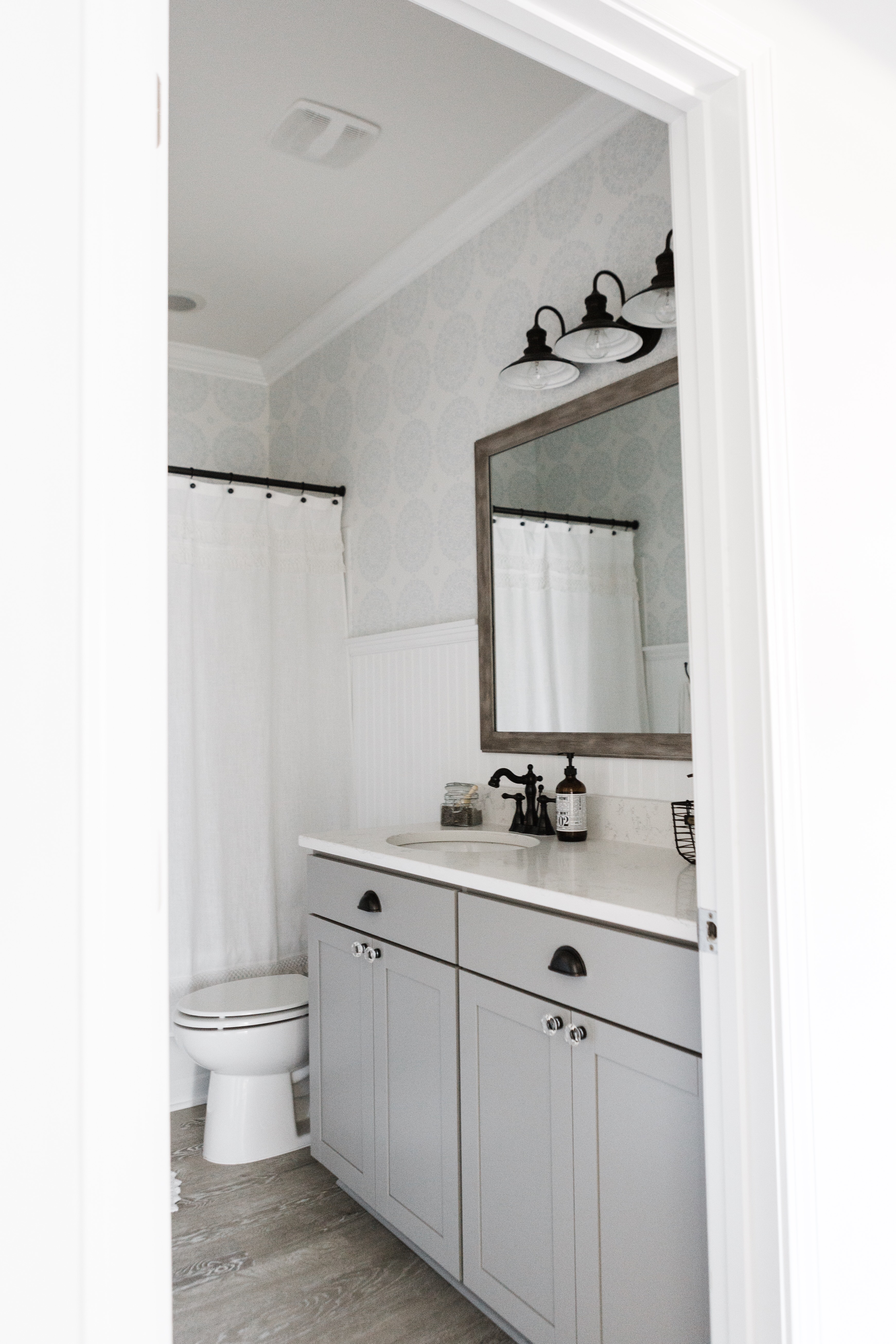
Since we had already bought and installed those products, I didn’t dare tell Stephen I wanted something different. HA! I did try to change out the half moon pulls but ultimately decided to make them work with some spray paint! Maybe they could be even better but I love the way they look with these glass knobs I found on Amazon (which I’m obsessed with by the way). I tried THESE from Home Depot which I love but decided to return them to save some money and because I wasn’t able to perfectly match the paint of the cabinets to fill in the previous pull holes. You may notice from the original design plan that I decided not to go with gold hardware. Oil-rubbed bronze is so timeless! Once I found the inexpensive glass knobs with oil-rubbed bronze, I kind of just stuck with it and ran.
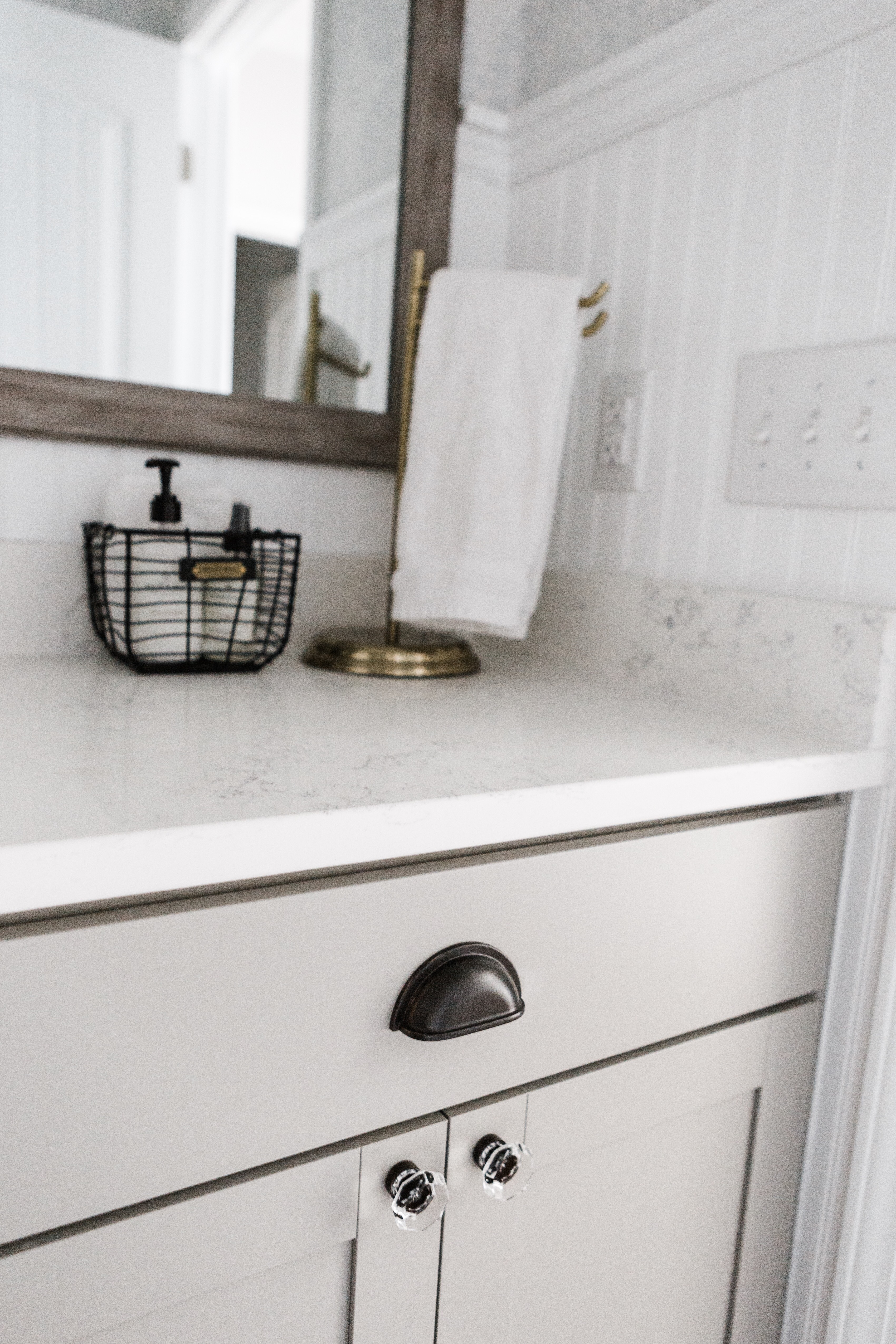
Words I focused on when designing this bathroom: cottage-like, classic, timeless, and calming.
THIS WALLPAPER is not removable like the laundry room wallpaper we installed but I just couldn’t pass it up. It felt so simple yet elegant. There’s just something about a pop of French blue that really speaks to me… Brooke from Nesting With Grace has a great tutorial for how to install wallpaper and sources if you need a place to start! We made the mistake of not starting the wallpaper at the ceiling with two inches extra at the top (no home is perfectly straight) and because of that, we had to install crown molding. It looks beautiful and adds character to the room but holy cow it was not easy. Once again, Stephen prevailed at something he’s never done before in his life. Have I mentioned that I love that guy?
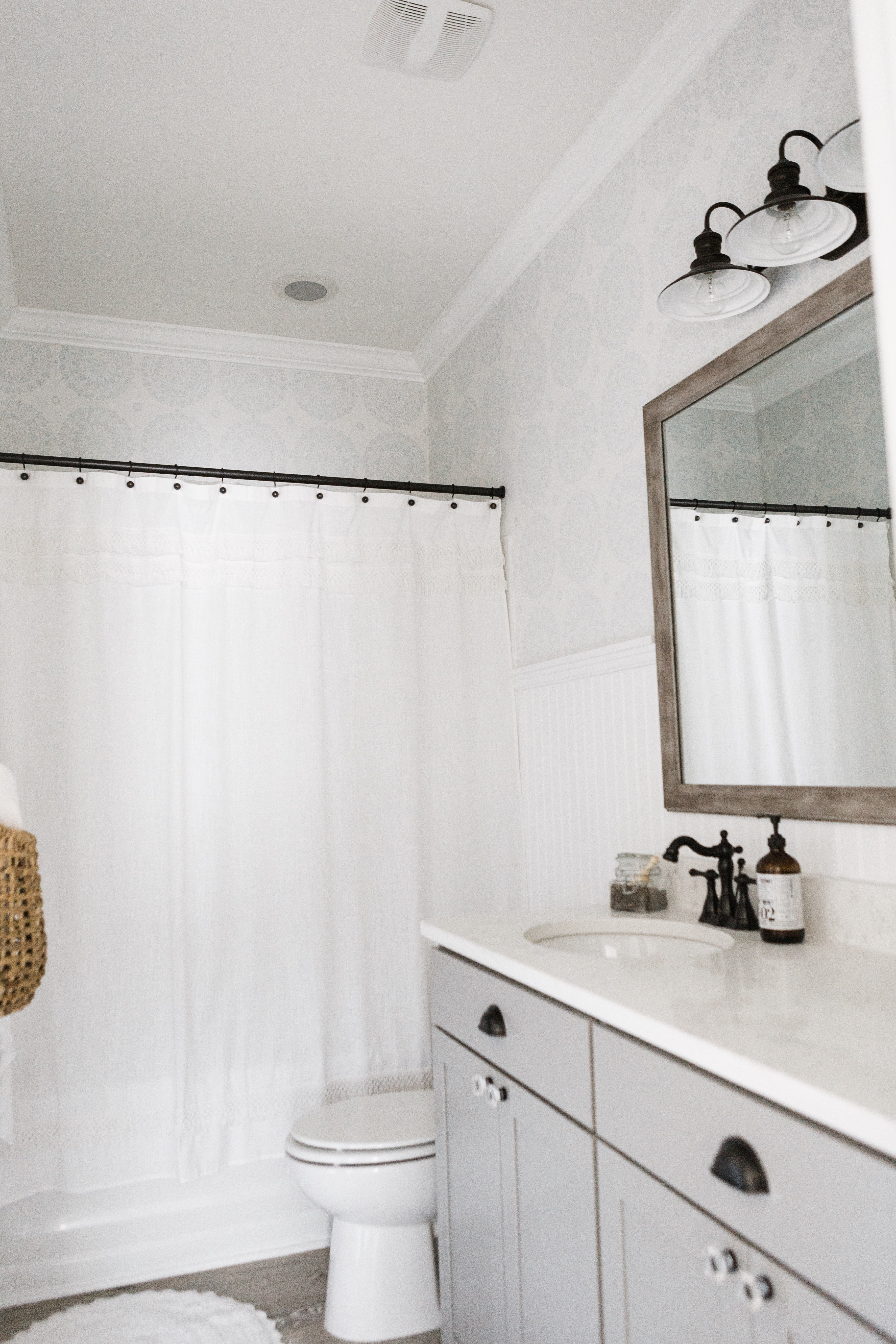
If you all haven’t realized by now, I love me a pretty wall treatment. It adds so much character to a space! We debated between a 1/4 high shiplap wall or bead board and the latter eventually won. We painted it the same color as all of the trim and doors in our home – Sherwin Williams Pure White. Originally, I had the color matched at Home Depot so that we could have it in an eggshell finish but I don’t think it was mixed correctly because once I was finished, it looked so warm compared to our existing stark white trim. I decided to put in a bit of extra time and repaint it with the Pure White in a glossy finish that we already owned. I was trying to avoid that because a glossy finish, while it is more durable, shows any imperfection. It does show some but oh well. It looks so much better to me than the warm white color that I had on there originally and instead of feeling frustrated like I did every time I noticed the difference between the two shades of white, I feel JOY!
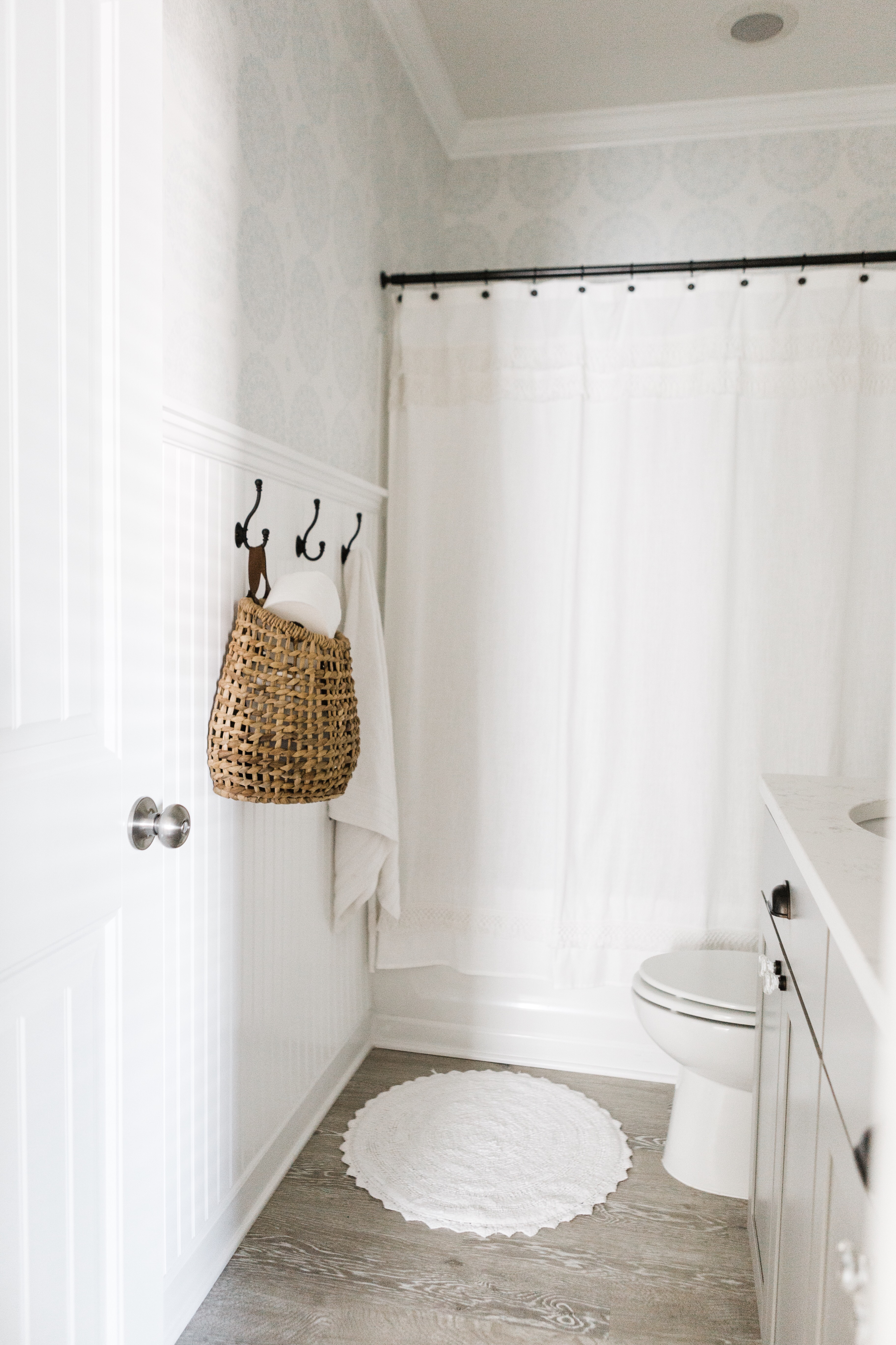
One of the most difficult but rewarding DIYs in this bathroom was transforming the silver mirror into one that looked like wood. I’m going to share the full DIY in a separate post! It took me a long time to finish because I couldn’t prevent paint from getting behind the frame but like the rest of the room, I love how this turned out and it’s pretty awesome to me that the only thing it cost me to complete the project was time.
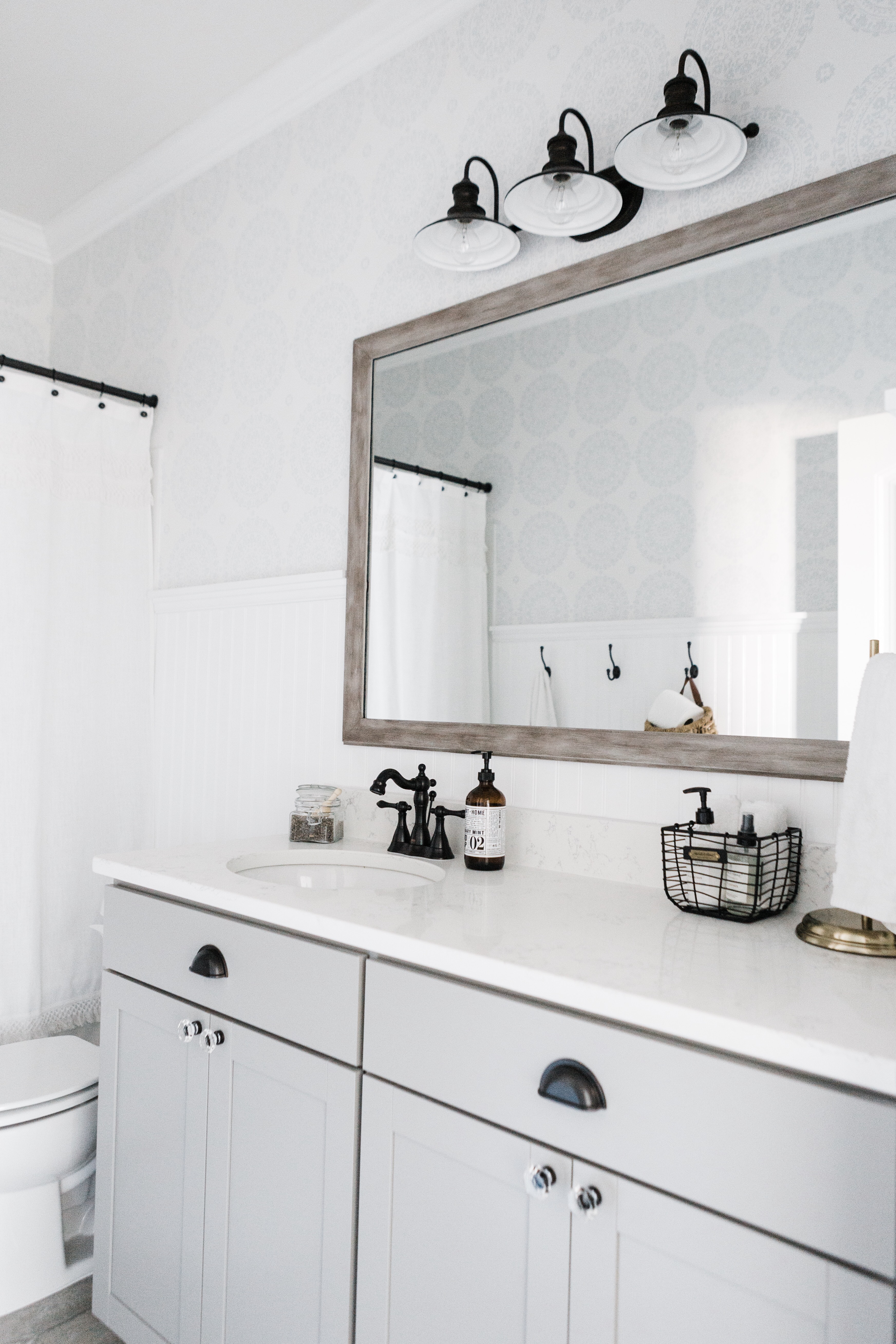
FAUCET | WALLPAPER | LIGHT | SHOWER CURTAIN (similar) | BASKET (similar) | KNOBS | PULLS | SPRAY PAINT (used to paint the shower curtain, curtain hooks, toilet paper holder, and pulls) | TOWEL HOOKS | TOWEL RACK | TRASHCAN | RUG
I hope this room inspires you in some way! If you have any questions, don’t hesitate to ask, okay?
I sincerely appreciate you all shopping through my affiliate links like the ones included in this post. I make a small commission when you purchase through these links at no extra cost to you. These funds help support my family and allow for us to produce better content for you all. I can’t thank you enough for supporting all that we do!
Other posts you might enjoy:
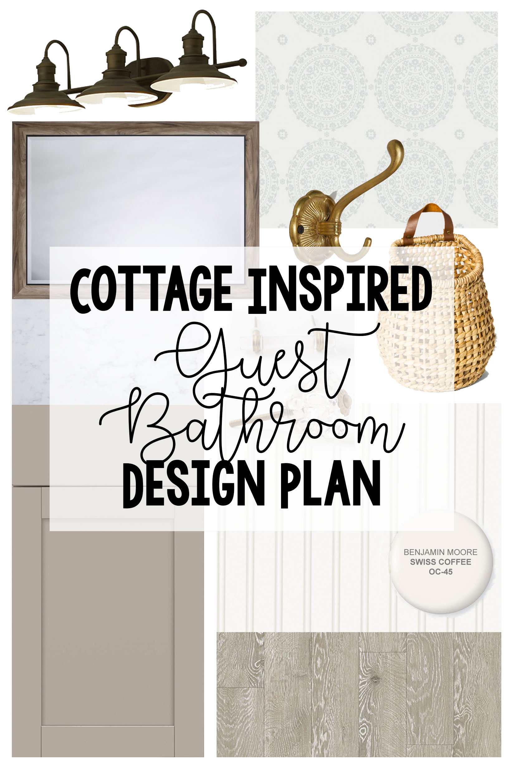
Cottage Inspired Guest Bathroom Design Plan
Guest Bathroom Makeover – Wallpaper is Up!
jordan jean
[…] a sucker for wallpaper. We loved this one so much in this makeover and loved how the blue in the wallpaper and in the painting looked together so we decided to use […]
[…] If you need a reminder of the before, here it is in all its lack of contrast glory (nothing was wrong with the vanity at all! You can see how we added some character to the bathroom with the same color vanity HERE): […]
[…] are some other room updates we’ve completed: master bathroom, guest bathroom, master bedroom, and our laundry […]